Paperlux Studio
N/AJune 14, 2023
Mindsparkle Mag


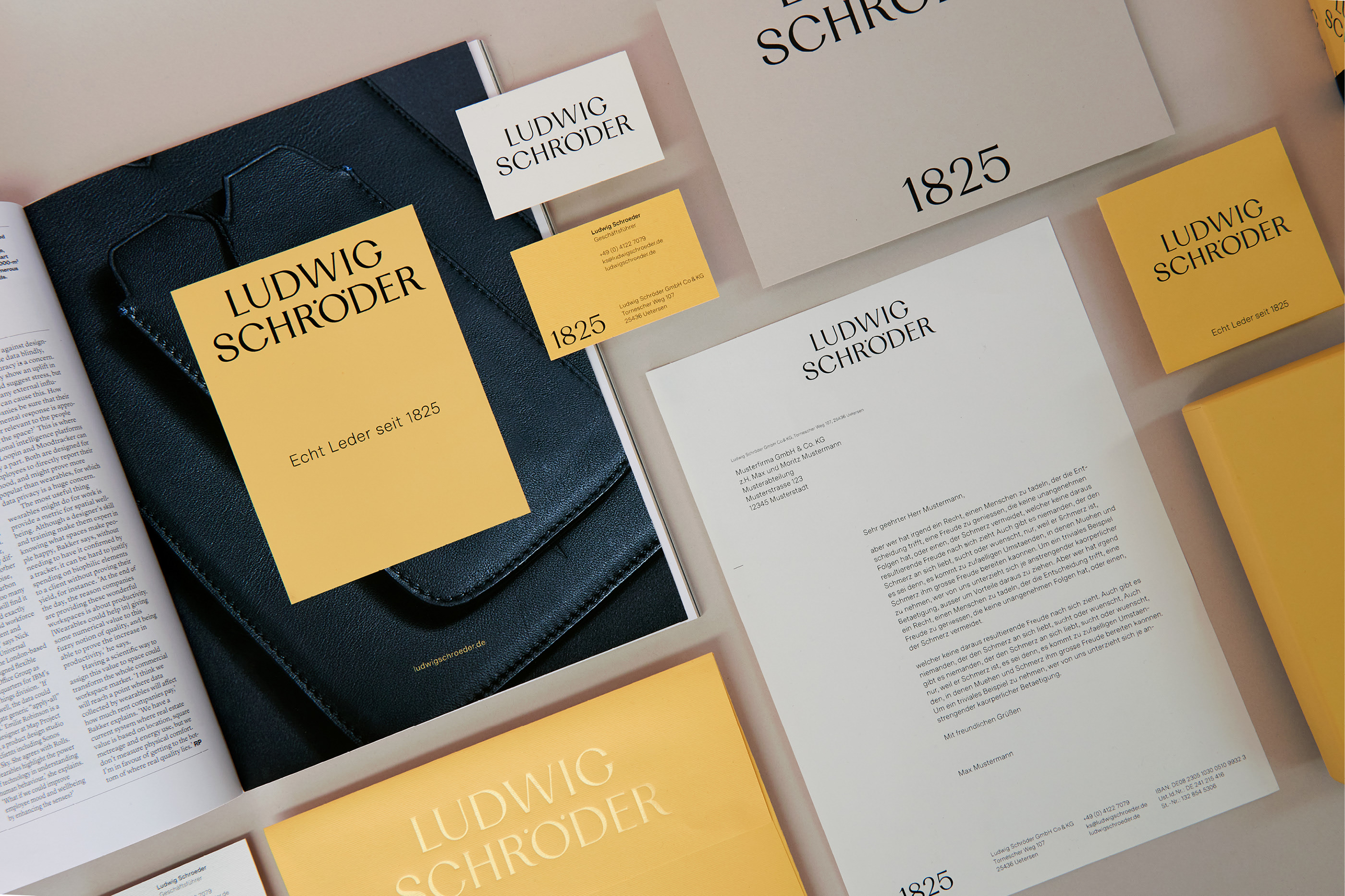
Craftsmanship and tradition are at the core of Ludwig Schröder, a family-run company that exudes elegance and timelessness. Paperlux Studio, their long-standing partner, recently redesigned their corporate identity, a project that ignited their passion for pushing creative boundaries.
The outcome of this collaboration is a concise and captures the essence of Ludwig Schröder. The careful incorporation of numerology adds a touch of mystique to the logo, reflecting the company's heritage and commitment to quality. A fresh corporate color scheme, featuring a delicate shade of yellow, complements the brand's story and evokes a sense of sophistication. With impeccable typography and a meticulous approach to web design, the overall aesthetic is clean, clear, and user-friendly, enhancing the brand's online presence.
Ludwig Schröder, now in the hands of the seventh generation led by Katharina Schröder, continues to thrive as a family-owned business driven by passion and dedication. The redesigned corporate identity seamlessly accompanies the transition, symbolizing a new chapter while preserving the brand's timeless elegance. From print objects to various applications, every aspect of the design beautifully reflects the essence of Ludwig Schröder, showcasing its enduring legacy in the industry.
Creator: Paperlux Studio