Lukas Vanco
N/AMarch 10, 2017
Mindsparkle Mag


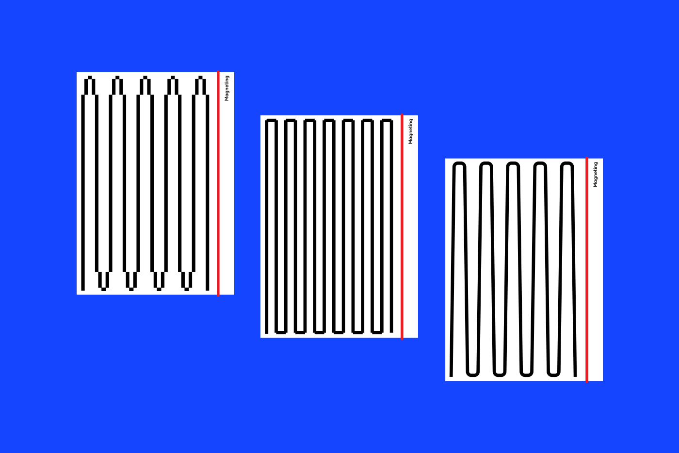
Magneting is a small online marketing agency based in Bratislava, Slovakia. Operates in B2B segment, with mostly Slovakia based clients. Magneting helps to clients in various fields within online marketing solutions. Helps to gain and target right audience, creating customized websites built on wordpress platform, optimizing and adjusting campaigns through Google AdWords and utilizes social media as a great tool for making mass campaigns more efficient and supporting brand itself. Magneting works with a lot of data and adjusts campaigns and creates custom solutions based on this data gained through various analysing processes. So the crucial stage is measuring. Entire visual brand concept is inspired on waving as a process of data acquisition. Also works great in relation to the name- vibration, tension and rhythm in meaning of magnetism. The visual identity has only one fixed logo (wordmark) and eight symbols shaped in letter M, made of wave, which can vary depends on its purpose. To create identity playful and timeless, symbols are designed as flexible as they can be. Repetitions, stretching, varying its stroke but always starts and ends on the bottom as well as letter M. Concept was not approved by client.
Creator: Lukas Vanco