Tom Garcy
N/AFebruary 16, 2022
Mindsparkle Mag


With soft flavors and an exquisite natural color palette, kombucha is one of the most drank beverages in the last years. And its energizing properties are a good alternative among other occidental traditional beverages. If you haven't tried it yet, we encourage you to do so! But if you still have some doubts, wait until you scroll down! Tom Garcy was in charge of Magu's rebranding, of course, a kombucha brand :)
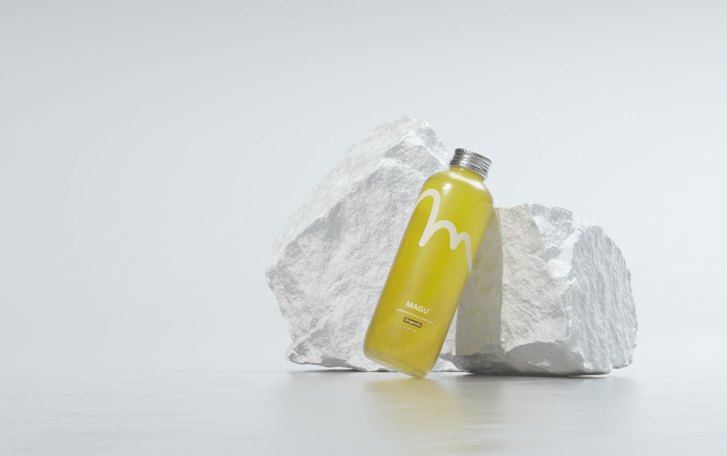
Take a look at how Magu changed from the first version, how something so simple as a hand-drawn "m" symbol could grow up and how minimal packaging can look. Let the content of a bottle speak for itself. Let the natural color give you a hint. Tom and his team brand the magic inside a beautifully designed glass bottle with a simple hand-drawn M. We love when creatives make the product stand out by using transparent materials and allowing the customers to enjoy its natural beauty. However, there's a lot of work behind clear packaging designs, as there's a need to be a balance of what will be seen from the outside.
Magu's overall new visual identity showcases the very best from its product. Moreover, the new adjustments bring a more consistent design to the brand plus a more elegant look and feel.
Creator: Tom Garcy