Art direction&design: Caterina Appignani, Photography: Adrian Lungu
N/AJuly 06, 2023
Mindsparkle Mag


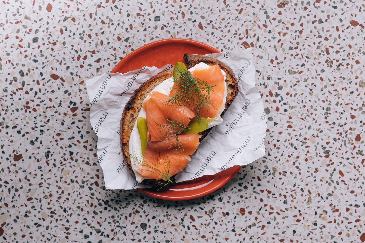
Coffee, Brunch, Wine: The Rebranding of Mammamia. Mammamia has always been a neighborhood bar in the small town of Imola, Italy. After 20 years in business, the bar felt the need to work on an identity that reflected its evolution over time. "Coffee, Brunch, Wine" became the brand concept to describe the multifaceted nature of the place and its offerings. The logo's visual identity is based on typography, starting from the Telegraph (Pangram Pangram) mid-century grotesque font with rigid angles, broken by a letter from Nib (Colophon foundry), which made the relationship between angles and roundness its dominant character. The relationship between classic and contemporary is therefore explicitly stated from the logo, and it continues throughout all typographic communication, pairing Telegraph with Argesta (Atipo foundry).
The typographic variation on the "m" also helps to read the name as if it were a single word, a proper name, a statement. The emphasis falls on "mia" (my), recalling a sense of belonging.The photographs, born from the collaboration with food photographer Adrian Lungu (IG @adrianwilldie | adrianlungu.it), reflect this new identity and bring flavors to the forefront.Finally, from a design perspective, the newly renovated space (concurrently with the new identity) carries on this continuous duality between retro elements with natural colors and materials with a vintage flavor, and elements with a distinctly contemporary visual language.
Art direction&design: Caterina Appignani, Photography: Adrian Lungu