Think Packaging, Steens, David Trubridge & Wrapology
N/AMarch 24, 2019
Mindsparkle Mag


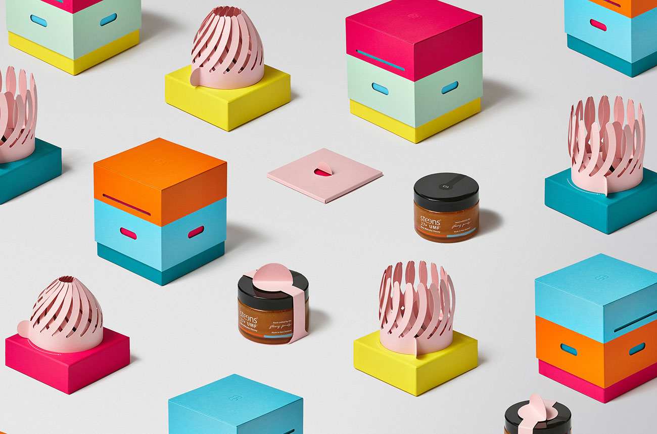
designed this beautiful packaging project for Steens Manuka Honey. Manuka flowers only open for a few short weeks of the year, and if conditions are just right, bees are able to harvest the nectar to make honey. With such a special release, the product needed an equally special and bespoke piece of packaging.
(DT) team designed the look & feel of the package and pulled the inspiration of the hive design from beehives themselves; to attract the attention of premium shoppers by contrasting bright and fun floral colours against all the black and gold packaging in the emerging and ultra-competitive Manuka Honey category.
Production was taken offshore, as
was sought after as being a world class luxury packaging manufacturer. Their capability of impeccable hand assembly and finishing of the components was vital as it was no small feat to produce at the standard desired.
A collaborative project: Steens, David Trubridge, Think Packaging & Wrapology.
Project management: Nikki Withington,
Photography:
// Photographic art direction + edits: