CB Design Co.
N/AApril 14, 2023
Mindsparkle Mag


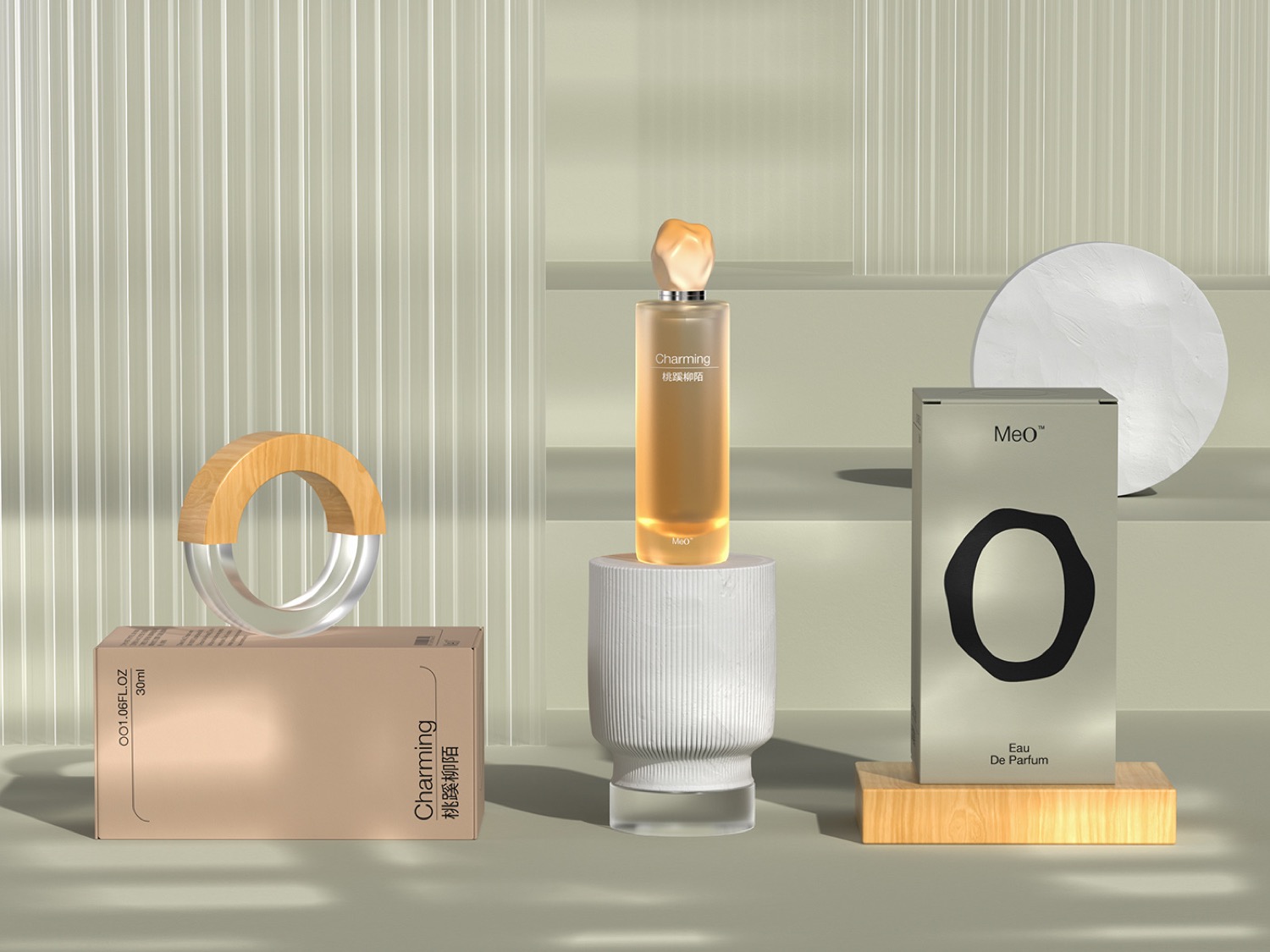
CB Design Co. created the branding for MeO. It is an example of modern and unique logo design, showcasing the impressive eye for detail of its creators. The branding incorporates a stylish and elegant color palette, featuring deep and exclusive tones that perfectly capture the essence of the cosmetics industry. The grid system used in the graphic design adds an additional level of sophistication to the overall presentation.
The MeO brand identity exudes the natural, polished, and charming qualities that customers seek in cosmetics products. With a focus on Eastern culture and art scent, MeO provides an energetic and sunny vitality that sets it apart from competitors. The result is a brand that offers a particular and unforgettable experience to its customers. The MeO cosmetic store is a perfect embodiment of this brand identity, creating an atmosphere that is both natural and cold, while still being inviting and full of energy. Overall, the MeO branding represents an exceptional example of graphic design, showcasing the perfect combination of creativity, elegance, and originality.
Creator: CB Design Co.