Konrad Sybilski
N/AJuly 10, 2021
Mindsparkle Mag


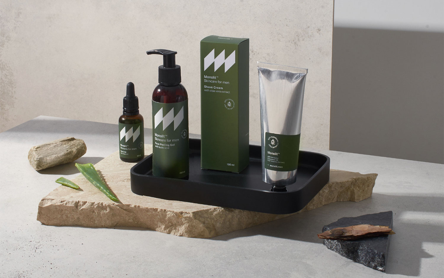
Nowadays, brands are shifting to a genderless audience, crossing pre-established borders. However, today we are showcasing a not-so-common-to-see skincare project, this time for men: Monolit Skincare. MonolitTM is a family products build for men, crafted from natural ingredients with admiration for what is pure and authentic.
Monolith is a geological formation (e.g., mountain, obelisk) consisting of a single, coherent rock block. It is the perfect example of simplicity you may see in nature and great inspiration for the brand. Nature-inspired, Konrad Sybilski designed Monolit's logo, a super simple block letter 'M'. The visual identity consists of a bold and mighty sign together with a dominant greenery color palette. It embodies the most recognizable elements of visual identity. Nature simplified is the brand's motto. Monolit provides a wide range of skincare products, such as face cream, shampoo, aftershave balm, beard oil, among others. The packaging's shapes are varied too. So, the designer seriously took care of the label's internal informational organization. Featuring a clean aesthetic, Konrad managed to create a consistent identity. He not only developed Monolit's branding but its naming, logotype, brand manual, and case study photography.
The project's presentation represents a trendy user kind of messy, passionate for nature, and thankful for what mother nature provides. The lighting scenery and the attention to detail are two key features of this far-fetched labor.
Creator: Konrad Sybilski