Re Design
N/AFebruary 08, 2024
Mindsparkle Mag


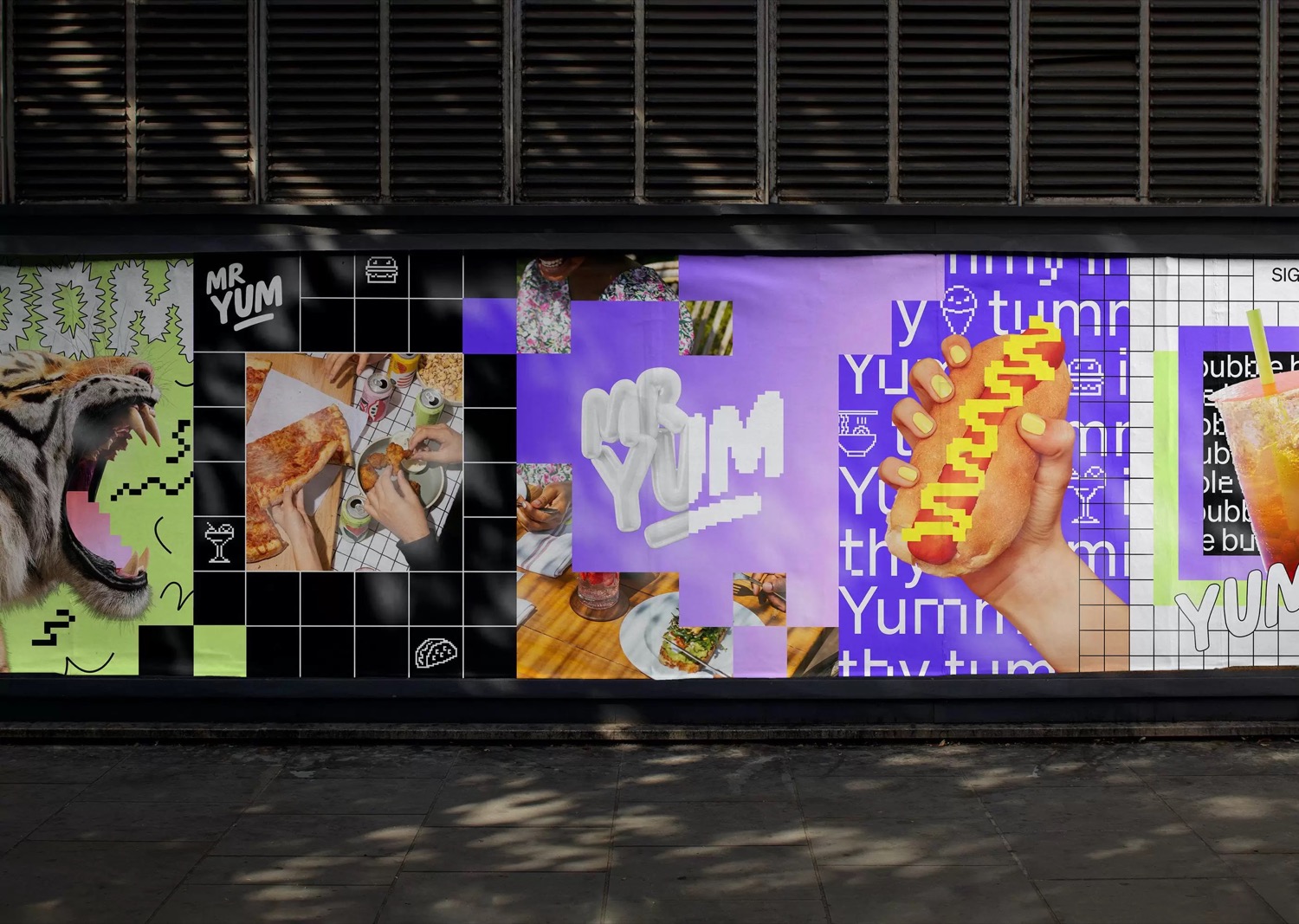
If you’ve eaten out lately, you’ve probably scanned a Mr Yum QR code. The mobile ordering and payments service is not just a critical part of the dining experience, it helps venues grow. Mr Yum needed a design system to convey their new positioning of ‘Better Together’, one that could power all parts of their business and capture the energy of their incredible culture. At its core Mr Yum is a fusion of food, technology and people. The refreshed brand designed by Re Design features tech-inspired touches such as a visible grid that sits beneath every layout and a custom typeface by Wei Huang that nods to QR codes, which is designed to be interchangeable with Söhne by Klim Type Foundry. At the same time, it’s chock full of personality thanks to a super cute iconography suite and a set of flavour-filled secondary colours that complement the predominantly black and white palette. Mr Yum is a product-first brand, so the ordering experience keeps things simple with a dynamic digital frame that conveys the seamless transition from device to table. On the website, things get a bit more expressive. Content targeted at partners is balanced by moments of fun introduced through colour, language and iconography.
Creator: Re Design