Chee Ho Tan
N/AJuly 08, 2021
Mindsparkle Mag


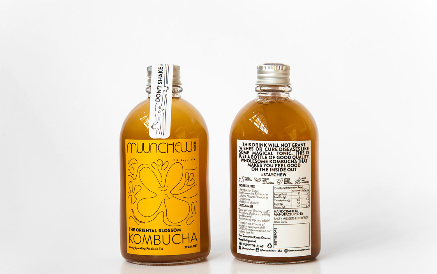
A couple of years ago, there was a Kombucha boom. And many brands were trying to incorporate it into their products. Today we are presenting Muunchew, a home-based probiotic drink brewery. It focuses on plant-based, raw, and unpasteurized kombucha with authentic ingredients. Their goal? To incorporate the goodness of fermentation and functional foods into everyday life without compromising the great taste. To succeed in the business, they asked Studio TCH to create their brand image.
Chee Ho Tan, this project's creative lead, got inspired by the genesis of this beverage. For instance, the logo is a representation of the Scoby formation. This formation is the core basis of all the brews and involves the symbiotic culture of bacteria and yeast. Let's get deeper into the packaging, the designers thought of the label's color to match the actual tone of the bottle's interior. Also, each color represents a different flavor and purpose, and the illustration varies too. This last resource consists of thin black strokes with an animated imprint, and some googly eyes warn you not to shake the bottle. So cute :) All in all, it's a very joyful and enjoyable design for this branding project. And a clear message to demystify the healthy but not magical characteristics of this beverage.
Chee Ho Tan is the head of Studio TCH, a graphic & interior design studio based in Malaysia. Transform, compose, harmonize are their core values.
Creator: Chee Ho Tan