LMNOP Creative
N/AJuly 08, 2020
Mindsparkle Mag


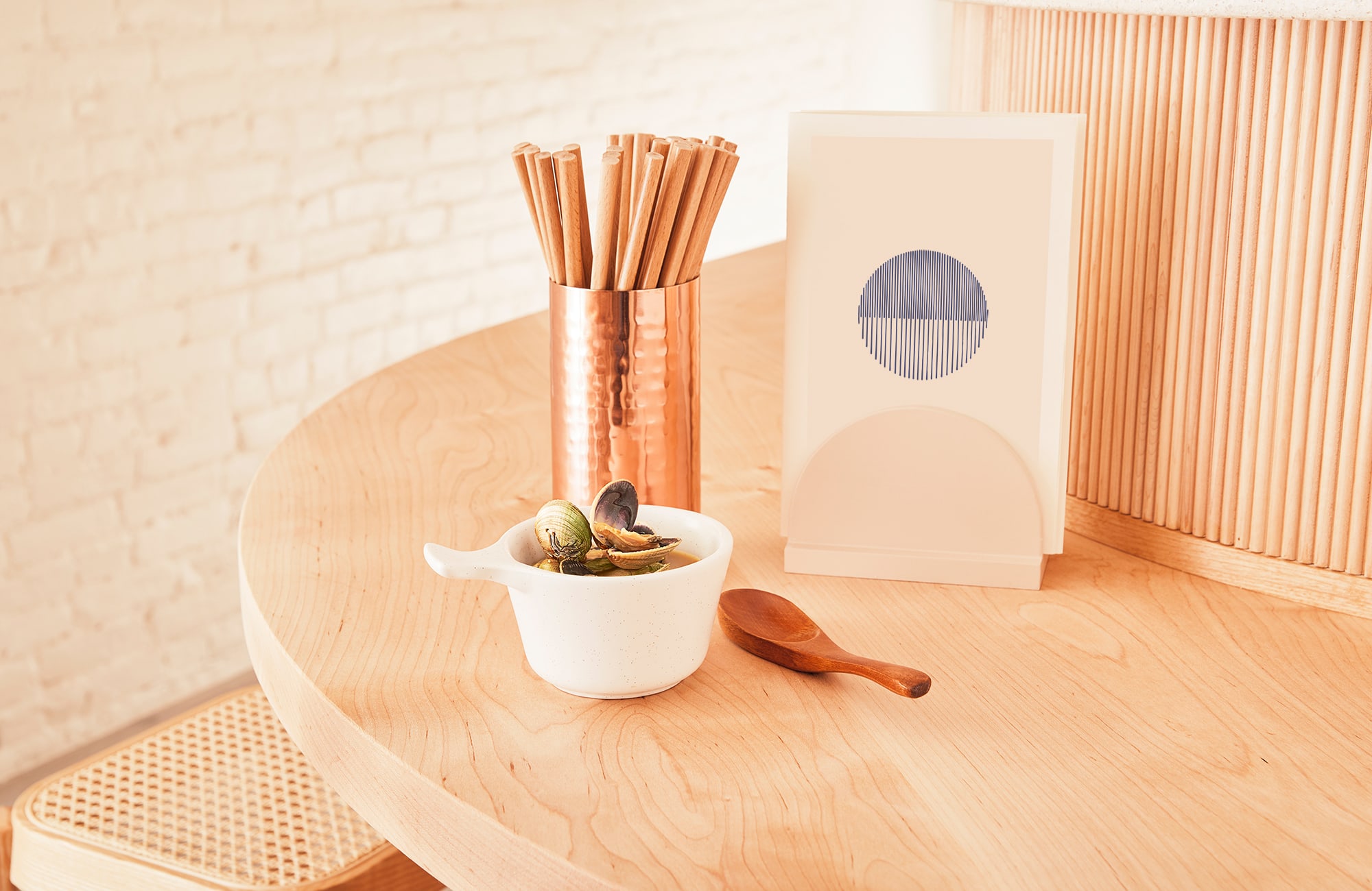
LMNOP Creative designed Nami Nori.The Nami Nori experience is steeped in the founders’ history of Japanese fine dining with an inclusive and cozy feel. The visual identity had to reflect the brand’s dedication to quality and traditional techniques while still offering something new to a neighborhood that’s seen it all.
LMNOP developed a visual system inspired by precise Japanese craftsmanship, drawing inspiration from several traditional artisan techniques: Woodblock prints inspire our hand-illustrated brand mark. Boro patches and kintsugi are behind the simple indigo secondary mark with foiled copper accent. The casual word mark recalls the rhythm of the ocean, a reference to the meaning of Nami. LMNOP stayed connected with interior designers MNDPC to ensure the branding and interior elements were integrated for a harmonious experience.
Creator: LMNOP Creative