Studio Patten
N/AJuly 01, 2021
Mindsparkle Mag


`Life is long if you know how to use it.’ The magazine we're showcasing aims to guide readers into living with more freedom and a happier mode of existence. Usually, we don't post many editorial projects, but we've planned a couple for this week. Today's issue features NewPhilosopher, Studio Patten, and an energetic edition
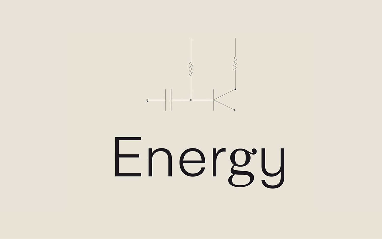
The editorial team asked them to create illustrations to fill the pages of its magazine answering to the issue's topic: energy. Designers came up with the idea of one main image, to sum up, the brief. It consists of an electric circuit with a very delicate thin stroke and curvy trendy typography in an off-white background. Creatives weren't shy when using color, but they chose the principal hue to be yellow because of its direct association with the theme. Plus, many blue shadows making the images pop out. All in all, we can say it's mainly a warm color combination the one featured. The illustrations themselves have a surreal style, somehow characteristic to the design studio. Human proportions are varied, and curvy irregular shapes are the prominent features. Also, full color it's a resource frequently used. However, for the fried egg composition, different techniques were used: gradients and a grain-textured image.
Patten is a graphic design and illustration studio based in Valencia, Spain. They trust in design as a starting point to develop and expand creative content looking for an aesthetic connection. They believe in a different and connected way of working. It doesn't matter the motive or the medium, but the content's language. They provide services from art direction to web design and animation.
Creator: Studio Patten