Creative Direction & Brand Strategy: Nine.SixThree
N/AJuly 20, 2023
Mindsparkle Mag


It was clear from the outset that branding my own studio would be difficult due to the absence of an existing brand entity or input from external sources. Since I was starting from scratch, I had the opportunity to self-reflect on how I saw my own work and to create this brand identity based off of it. It was a blank slate in its purest form. We developed the identity based on several key non-negotiables. First, the studios strategy had to reflect not only my approach to work, but also my approach to thinking. The identity must convey a dedication for research and a keen understanding of it. Aside from demonstrating research acumen and expertise, we had to signal dependability and reliability as well. Our tone of voice developed naturally and evolved to be confident, never arrogant. Nine.SixThree was founded on the belief that every business has a story to tell.
We are driven by a sense of curiosity and a passion for discovery. Together with forward-thinking cultural and commercial brands, we uncover their purpose, clarify core values, and build a foundation for their long-term success. By leveraging tactical intuition, we develop brand strategies and identity systems that connect us deeply to the world around us. Ultimately, we seek to produce considered solutions that convey our clients' brand essence and propel them forward into modern culture.We follow a strategic, and research-based decision-making process, but we also trust our gut and believe that even in the most challenging circumstances, right paths will emerge.
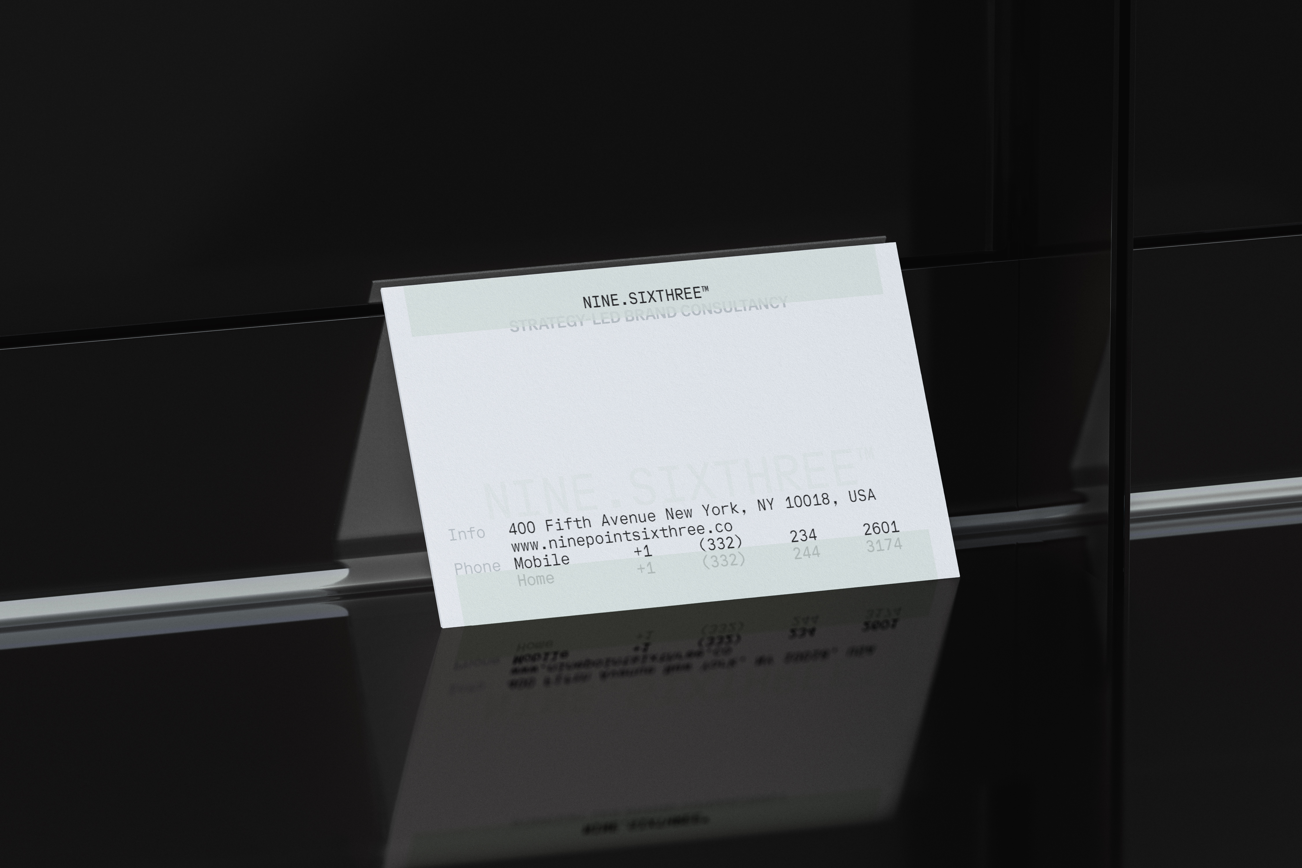
This brand idea, tactical intuition, serves as our north star. It guides our design concept to strike a balance between being systematic yet natural, calculated yet spontaneous, sensible and imaginative, tangible and abstract.A simple, no-frills logotype reinforces our commitment to transparency with clients and positions us as an adaptable asset, capable of collaborating in multiple industries. It's all about the details, even down to the trademark or registered mark symbol, which protects the brand and builds client trust. Based on a formulaic system, the trademark symbol changes size based on the size of the logotype, which is divided by three to determine the height of the trademark or registration symbol. As far as the typographic system is concerned, we chose to pair two typefaces that are both engaging and straightforward. Lineto's typeface, LL Riforma, released in 2012, lets go of kerning restrictions and focuses on content. In contrast, ABC Walter Neue's precise glyph designs enable text display across all communication media including print and digital. In order to maintain consistency in type size and composition, we used the same grid throughout all printed materials. The use of neutral colors in the background breaks up a completely white background, adding new depth.The name Nine.SixThree takes inspiration from the printing press, which represents an era when information and content widely circulated. The brand strategy and visual identity emphasize our ability to articulate, distill, and define new realms of reality.
Creative Direction: Nine.SixThree™ Design Direction: Integral Typography Verbal Identity: Valarie Frost Photography: Javi Rico