Imagine branding studio
N/AJanuary 08, 2024
Mindsparkle Mag


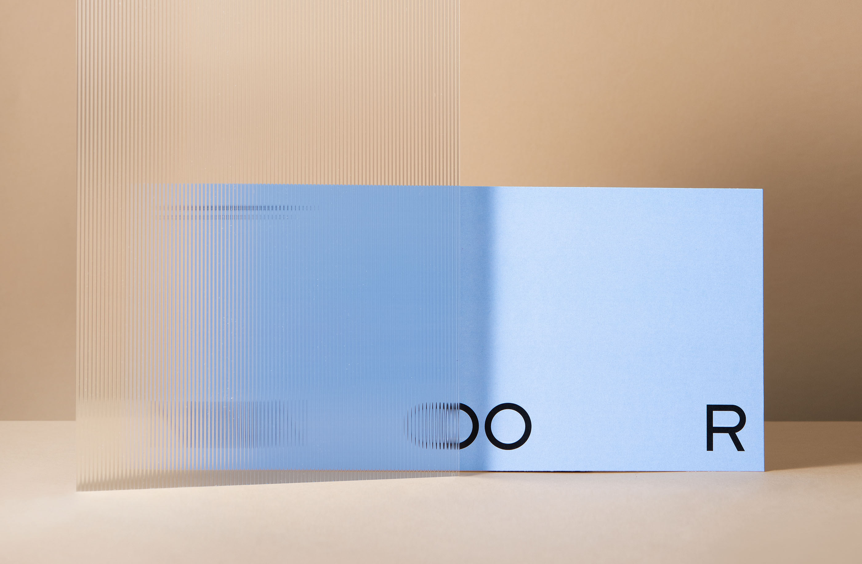
The name NOOR comes from the Arabic word "noor" which means light. It reflects the companys business approach and highlights a new era of law practice. The new minimalistic and dynamic logotype designed by Imagine branding studio showcases the flexibility to adjust to the different needs and issues of their clients. The Logo can adapt to any composition by expanding the gaps between letters N and R, while two static OOs are standing in the middle. It represents the merger of two companies.
NOORs core strength lies in the ability to notice and highlight problems before they even materialize. To emphasize this the studio took the yellow marker often used to highlight important parts in text and converted its neon stroke into a dynamic graphic system. The highlighter strokes form a series of structured patterns that can be adapted to any composition.
Creator: Imagine branding studio