Gláuber Sampaio
N/AMarch 11, 2022
Mindsparkle Mag


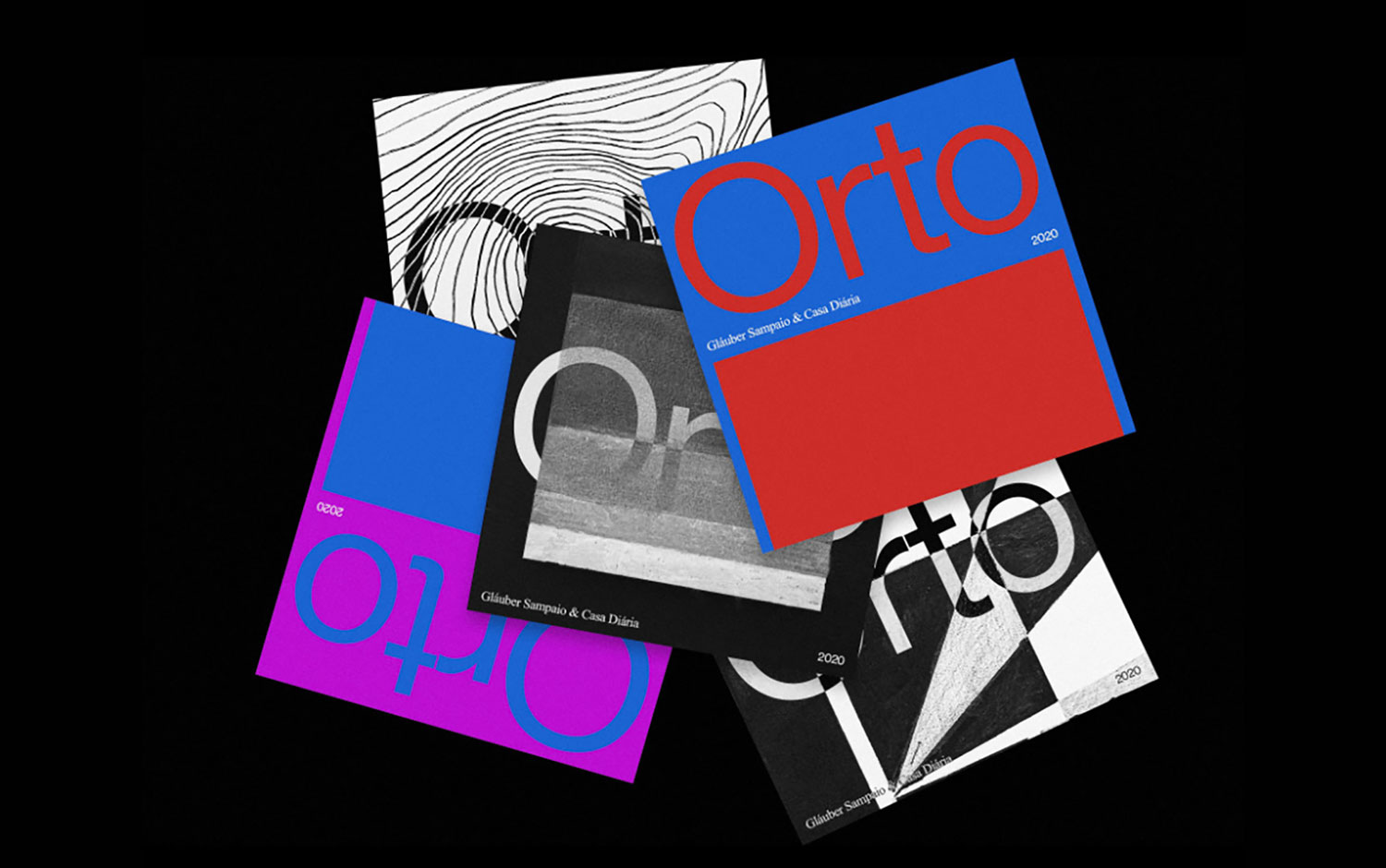
Gláuber Sampaio was invited by Casa Diária, an independent shop in São Paulo, to put together an exhibition of his work with handmade illustrations – which started his series, back in 2019, entitled “Linhas” (Lines) and “Estudos Geométricos” (Geometric Studies). Orto, in Brazilian Portuguese, means the beginning. This project features not only the results of a hobby but is also a wrap-up of different areas Gláuber likes to explore: design, code, music, and art.
Orto's visual language uses minimalism to balance the different styles of the illustrations, marked by powerful lines, repetitions, and geometric textured shapes. He believes in a few elements are enough to highlight each piece of work while using saturated colors. He generates contrast between the art style and graphic design aesthetics. Like his other personal projects, the inspiration for the visual identity comes from the designer's observations and ideas for the digital design work itself. In this case, the illustrations work both as the main subject on the website. Also, they work as an expressive element that supports the identity and the name of the exhibition.
This project was built with VueJS and Locomotive Scroll by locomotive.ca.
Creator: Gláuber Sampaio