Maude Paquette-Boulva
N/AAugust 19, 2021
Mindsparkle Mag


Today's design project we're showcasing takes us to the loud and full of energy New Orleans. Founded in 2019, Oyster Sunday is a company that provides operational support to hospitality clients. It's strongly linked to the food and beverages industry. They offer support, marketing, and branding resources to build an economy scale. Their identity was creatively in charge of Canadian designer Maude Paquette-Boulva, Paquette studio founder.
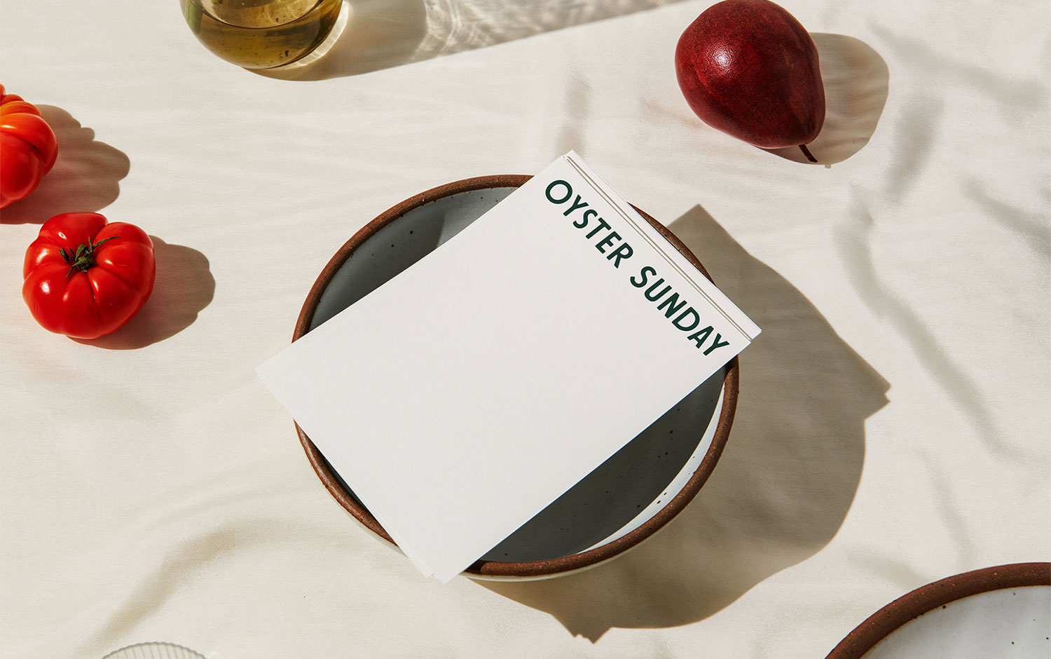
With strong ties to the food and beverage industry, the company's identity takes on restaurant-style visual cues. Plus, it has a playful twist among the other companies in the field. This branding project features a worth-saving color palette, which brings nature's soft and deep shades we usually see in varied ingredients. Respecting art direction, Maude's idea to incorporate vegetables that are part of the color palette intervening the stationary design gives a jolly and playful imprint in such a clean and perfectly aligned design. The contrast among them creates a harmonious and balanced composition. For the typography, the use of all-caps for the name fits just right. The type itself has a deconstructed style with a vintage restaurant aesthetic.
All in all, this branding project has a classic, joyful style based on understanding and empathy, resulting in a stunning design. The result truly takes us to the food and beverage industry. The studio managed to translate Oyster Sunday's story and deep purpose: build a community and culture in the hospitality industry, allowing everybody to progress forward.
Additional credits Photography: Cody Lidtke Styling: Maude Paquette-Boulva
Creator: Maude Paquette-Boulva