Never Now
N/AMarch 07, 2020
Mindsparkle Mag


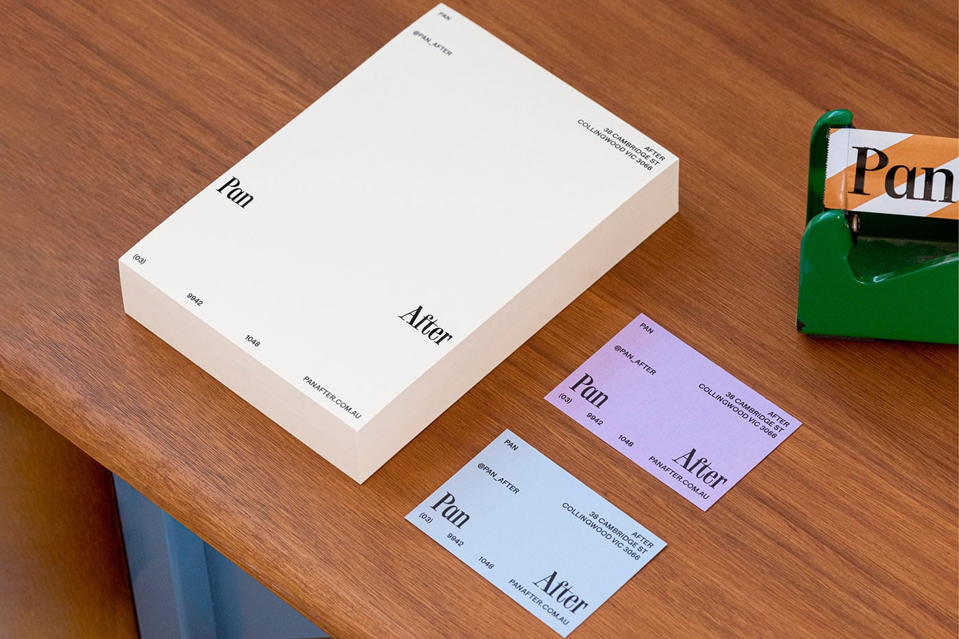
Never Now designed Pan After identity. Pan After sells a collection of carefully sourced homeware products online and from their store in Collingwood, Australia. With a focus on handmade, ethically produced and environmentally conscious goods, the Pan After range not only considers the aesthetic value of an item but also the process of how an item is made, who it is made by and the materials used.
Their identity, by Melbourne-based studio Never Now, introduces a melting pot of clashing colours, unusual typography and jarring negative space to create a visual system that celebrates flexibility and structure – much like the store itself. The wordmark is set in Toy, a condensed serif by Zurich-based type foundry Out of the Dark. Accompanying typography uses Phil Baber’s sans serif Maria. The two typefaces contrast against each other – Toy is compact and elegant, while Maria is geometric and brutal. The combination of irregular spacing and fine margins reflect the quirky but curated nature of items available at Pan After.
Creator: Never Now