Moby Digg
N/AApril 18, 2018
Mindsparkle Mag


The team at Panama Plus festival asked Munich-based design studio,
, to design their complete visual appearance, animated teasers, and digital presence. Panama Plus is an interdisciplinary music and arts festival that constantly tries to build bridges between cultures and societies.
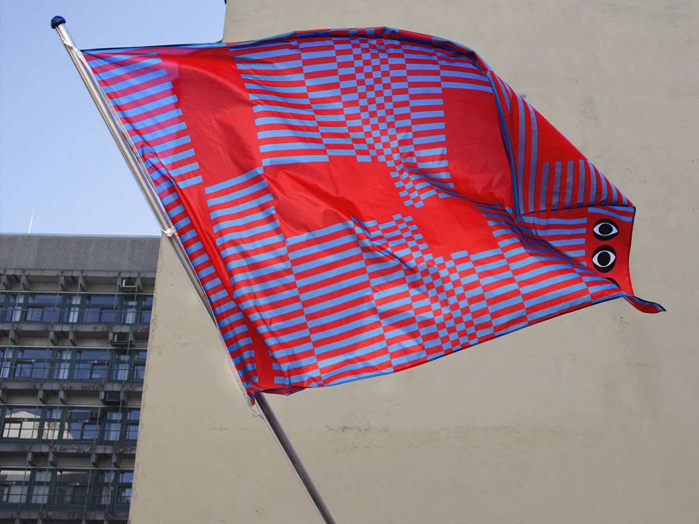
'As the festival tries to push boundaries and broaden your point-of-view, we thought about how we could incorporate that concept into a visual system. The branding is based on a visual analogy to claim undefined territory. Maps often use hatching to mark a certain area – we took that as a key-element and started to play with it, until we reached a state in which the pattern would use strict geometric forms and even create optical illusions. Optical illusion is an interesting analogy to the festival: You create something, that – as a fact – is not there, but still you are able to perceive it and therefore might think about what you think is real or what might not be.
To accompany the design identity, we designed a new font, which we later named MD Maya. The festival tries to create a utopian world in which it's visitors head for an alternative experience and (hopefully) forget in which reality they are currently in. We wanted to create a font, that could embody this mentality. The symbols of the typography somehow form signs but could also be the silhouette of a building, a mark in a cave. The font was used for the complete visual identity of the festival, which included flyers, banners, posters or advertisements.'
Creator: Moby Digg