Passport
N/ASeptember 05, 2021
Mindsparkle Mag


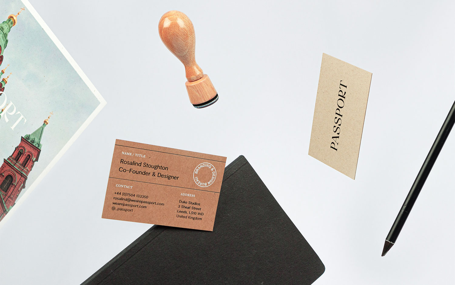
Do you have your passport up-to-date? If not, no worries, as today we have a bunch of them as we're showcasing a travel-inspired branding design. To celebrate Passport's 8th anniversary, this design bureau decided to go back to 2012 and visit its brand identity. The changes haven't been rad; however, it's always good to refresh and update. We know this applies to every aspect of life too.
Based in Leeds, the studio's identity includes branding, print and web design. As they grew, their experience had to represent and be renewed by designers to fulfill their new goals and continue growing. Passport's creatives began by designing a new logotype set in a beautiful display serif typeface. To complement it following the core concept of the studio name, they have also come up with a visual language inspired by vintage-styled travel documents where some reddish accents tended to appear, mainly with stamps. Designers traveled back in time to perfectly recreate an antique, classy aesthetic featuring hole punches, rubber stamps, and squared boxes to fill with data.
The color palette's decision to keep it neutral and sober was to give a utilitarian design combined with the stationary has high-end print finishes such as foil blocking. Plus, the natural tones and the subtly textured paper reflect the vintage imprint. For the cake's cheery, the inclusion of landscape photographs across branded postcards adds a lively touch of color to the overall branding.
If you're excited to travel and get to know this wanderlusty design, this is your ticket to scroll down and enjoy the flight!
Creator: Passport