Orchidea Agency
N/AOctober 17, 2021
Mindsparkle Mag


Nowadays, there are many and varied diets people choose what products to eat and their quality. Moreover, they are most likely to not only restrict their alimentation, but it has more to do with a belief on what's right or not to consume depending on its production process, whether it explodes animals or even hurts them. Continuing with the diet line, today we're presenting Perla Hesla's packaging design by Orchidea Agency.
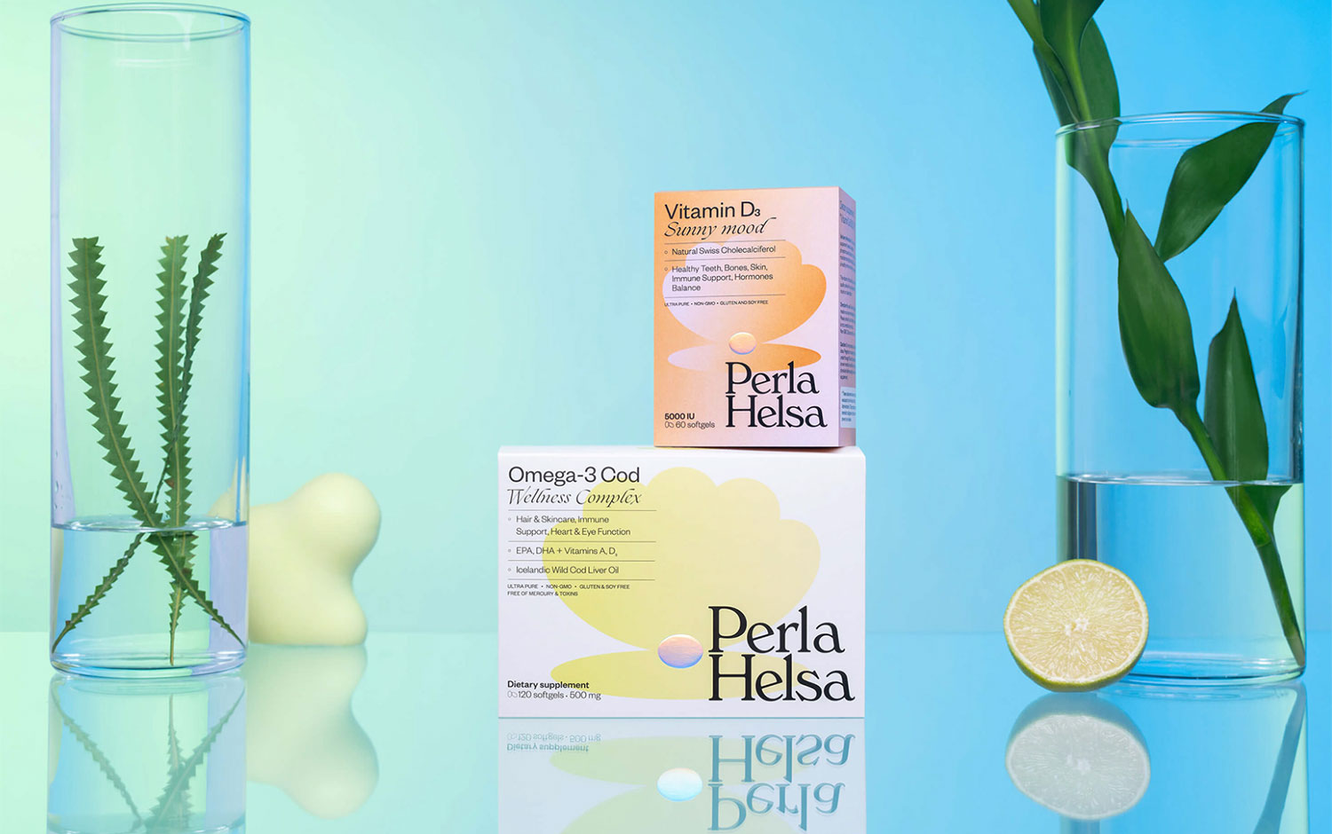
Perla Hesla is a brand of dietary supplements for daily use. The concept for the branding revolves around women, as they are 90% of their clients. And its packaging includes one of 2021's trends, color gradients, subtly used, filling the shells with a pale color. Plus, designers wanted to emphasize the pearl inside these beautiful sea creatures by embossing them with silver foil. The art direction for the packaging also includes color gradients more dramatically, with a more eye-catchy appeal for social media.
All in all, Perla Hesla's appearance has a holistic style that represents the diverse roles women take on these days. And its colorful and lively approach is super beautiful and fresh.
Additional credits Art-Direction, Branding & Design: Lera Shaposhnikova Brand Strategy: Natalia Gubenko Design: Kristina Govorukha Photography: Akim Karpach Retouch: Daria Chervona Creative Support: Alex Badovsky
Creator: Orchidea Agency