YNL design
N/AFebruary 15, 2020
Mindsparkle Mag


YNL DESIGN designed Raon Womens Clinic. Unlike traditional hospitals that emphasized only the aspects of treatment, Yonsei Laon Obstetrics and Gynecology provides a cozy space for those who visit the hospital, and special care services for doctors and customers. Yonsei Laon Obstetrics & Gynecology aims to make your time more valuable and meticulously accessible through meticulous care and comfortable space.
Thoughtful health care service that considers the mind of the customer and a warm and comfortable atmosphere that can focus on the treatment completely. The project contains the functional and emotional values of the brand, and differentiates brand identity and consistent brand image building that reflects Yonsei's core values.
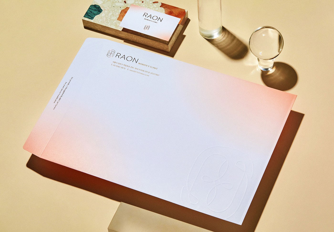
The brand symbol expresses a joyful glow that emanates from the inside, meaning that you can rest and recover my health through Raon's delicate treatment. The combination of the three concepts, the symbol of joyful light, initial R and subtlety, visualizes the concept as a symbol and gives the customer a special experience and mood that is respected as a refined mood.
Raon's color system has brought the medium of light into the lead role in BI work. Appreciating ‘light’ brings us to a moment of meditation and reflection, through which we experience the journey to the light, facing our inner spiritual light. The colors that express light convey the meaning that you will have a healing time facing yourself in a unique design space.
Creator: YNL design