Perky Bros
N/AAugust 17, 2021
Mindsparkle Mag


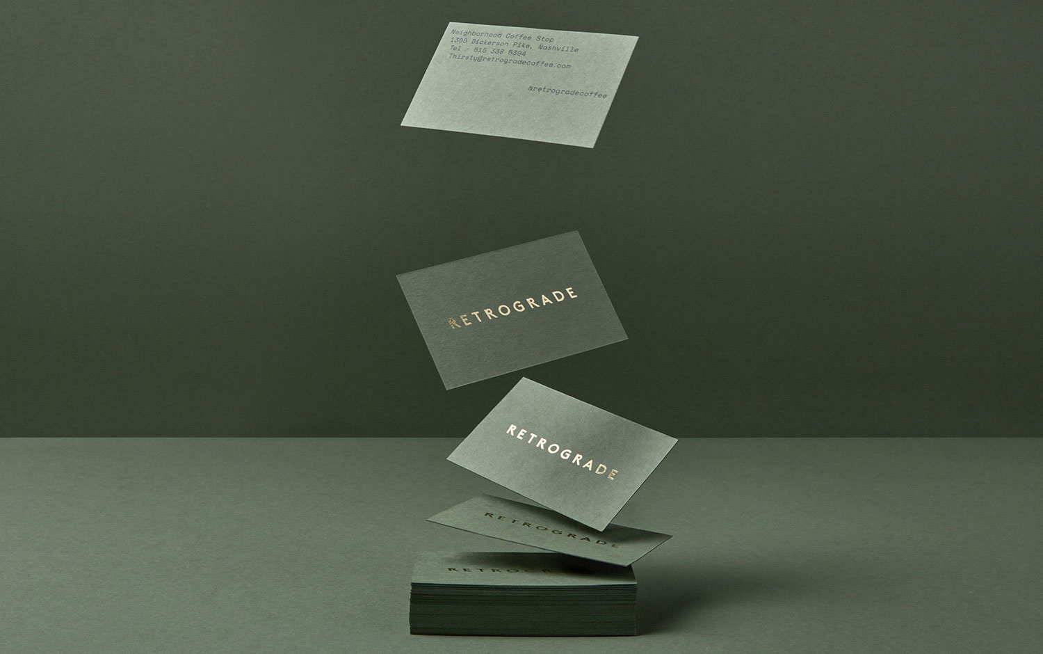
Retrograde's branding is about MW Real Estate's office environment set to feel like a coffee shop. They decided the best way to do this was to build, well, an actual coffee shop. Retrograde is a cozy coffee shop nestled into eastern Nashville, dedicated to providing the neighborhood with a welcoming spot to slow down and press pause for a moment on the daily path. This branding project is creatively led by Perky Bros design studio.
Its name has to do with the cosmic phenomenon, and its visual identity recreates this unworldly theme with a vintage approach. Particularly the moment when Mercury appears to hover and begin to move backward and put our lives upside down. The reverse italic logotype features three custom Sputnik Rs, with geometric counters referencing Mercury, Earth, and the Sun. The brand symbol pulls them together in a simple interstellar monogram. And its calming color palette uses a touch of bright gold fit for a NASA satellite.
All in all, Retrograde branding design shows a beautiful style by Perky Bros studio. Designers created such a powerful concept like Mercury's strength to mess everything up. The overall aesthetic Perky Bros managed to create for this office is just where we would love to spend some time writing for you.
PS: The last picture contains sensitive content for coffee lovers.
Photography: Nicola Harger
Creator: Perky Bros