Moby Digg
N/AFebruary 11, 2017
Mindsparkle Mag


For
consulting
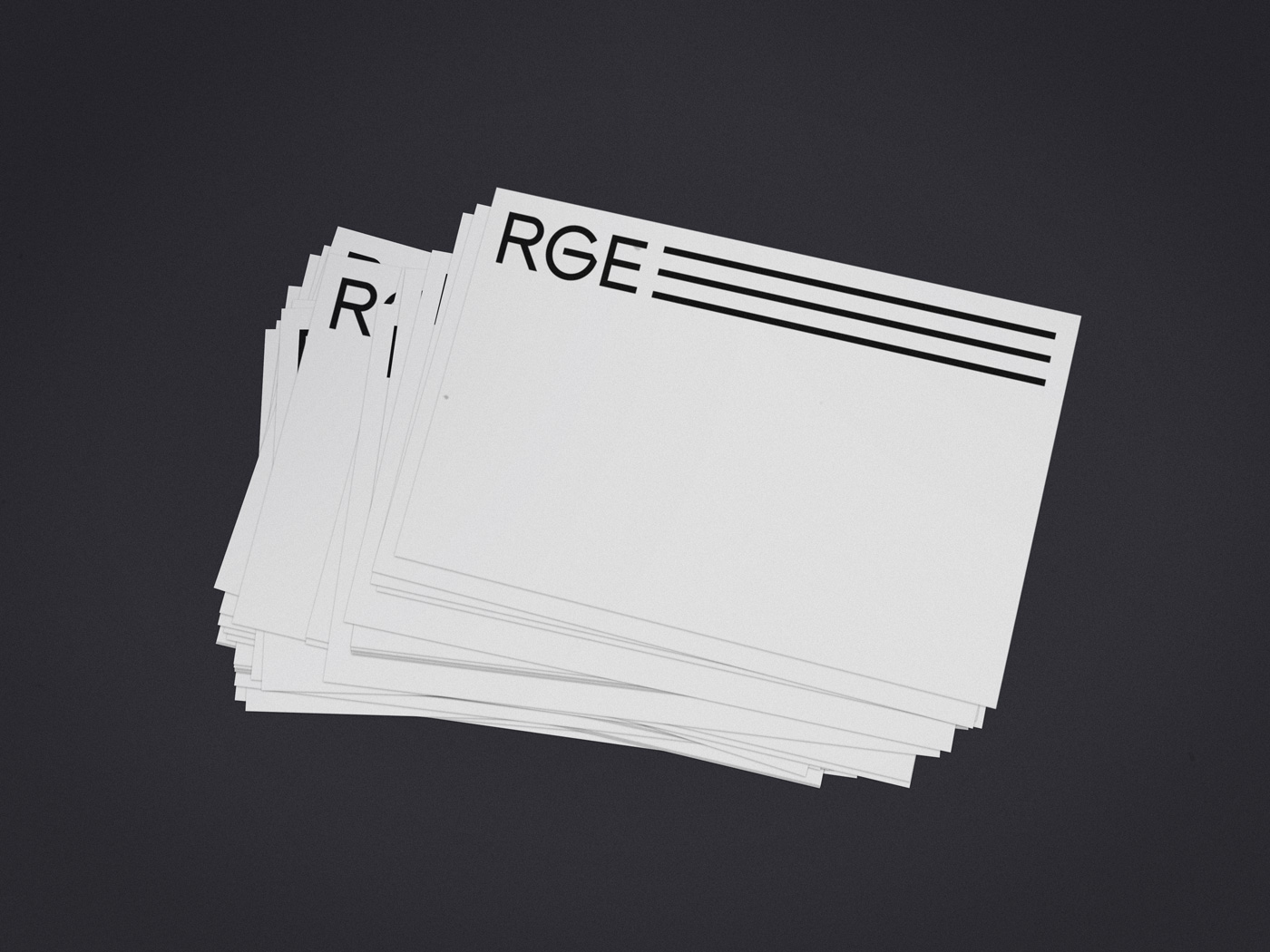
developed a full branding set, including logo design, keyvisual, brand guidelines, a commercial corporate website, business corporate letter, contact-cards, signage and so on. The minimalistic corporate identity was based on the three founding partners (three lines). After they formed the company's base, the business grew hence more and more employees were added (symbolized through more lines). The blue circle stands for the passion and emotion the company puts in every project. It therefore takes a huge effect on the way / path a project can possibly take and alters the original lines accordingly. The lines do not only connect a starting point and an ending, but also symbolize the path until a project is done. The designers searched for a simple graphic system and a decisive color combination, which builds a recognizable brand. The clean approach represents the clients vision of his consulting services and brand core. The animated website stands out in comparision with competitors and helps
to differentiate it's brand and position itself as a thought leader. The keyvisual is animated itself and invites to subtle user-interaction.
Creator: Moby Digg