Chapter Studio
N/AAugust 31, 2019
Mindsparkle Mag


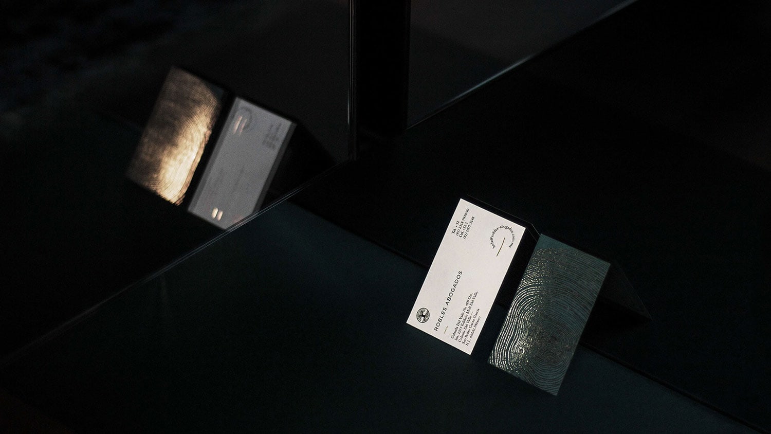
Chapter Studio designed the branding for Robles Abogados - a law firm located in Monterrey, Mexico. Roble translates to oak, the type of tree.
This inspired the blueprint of the project. Following the very natural and unique aspect of every oak's inner print, Robles portrays its uniqueness in a very delicate foil lining on a strong, dark and powerful green.
The oak icon represents the solid background of the Robles family, and the very deep roots in which the law firm is founded on. Its values, practices and purpose all interject in the logotype making it a truthful, rich and heavy family symbol.
Creator: Chapter Studio