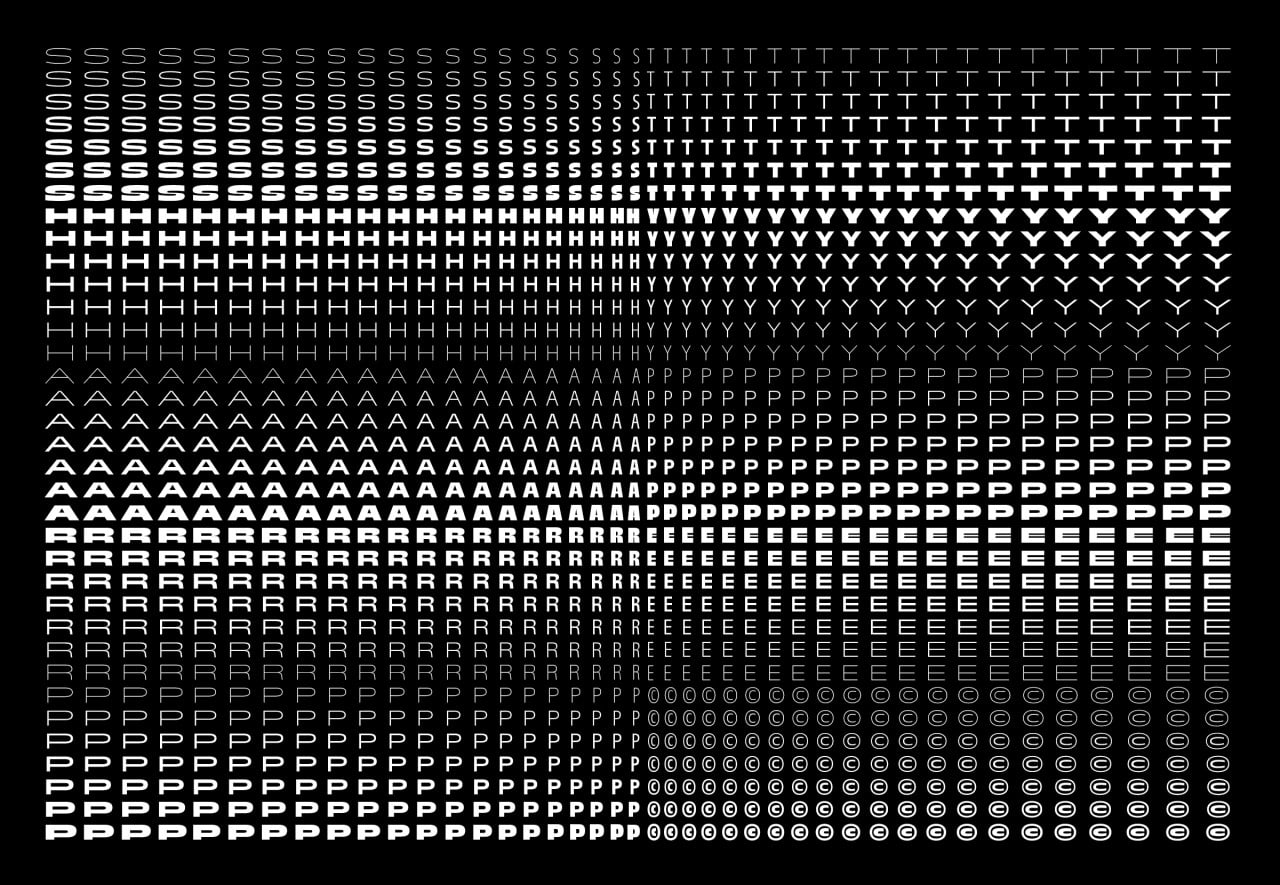
Sharp Type
N/AJune 08, 2020
Mindsparkle Mag


is a digital type foundry based in New York City. Their foundry produces custom and retail typefaces for brands, design houses, publications, and more. They believe in designing typefaces with utility and beauty for the modern era.
Among their library, they are exceptionally proud of the Ogg superfamily and upcoming expansion of the Beatrice superfamily. The foundry is also committed to collaborate, support, and publish work by new talent including: Trois Mille by Marc Rouault, Garnett by Connor Davenport, and Post Grotesk by Josh Finklea. There are exciting releases lined up, and even more in store for our future collaborations.
Ogg Superfamily
is inspired by the hand lettering of 20th-century book designer and calligrapher Oscar Ogg. The typeface captures the unique mix of calligraphic and typographic form he achieved through his use of hand carved pen nibs, brushes, and white-out. The foundry first released Ogg in two styles in 2013. Over the last six years, the iconic typeface has grown into a superfamily with 4 additional weights, 10 total styles, and a complementary text family.
Beatrice Superfamily
broke ground in 2018 for its internal contrast system that was all at once bold, elegant, and refined. The type family is super high-contrast, and tightly packed for Display purposes. Along with its release, Beatrice Text was designed as a complementary family with a standard low-contrast cut to function in a wide range of optical sizes. Later this year, the superfamily will get an update to include Beatrice Headline, Beatrice Deck, as well as updates to its signature italics and new oblique styles.
Trois Mille by Marc Rouault
Sharp Type's latest release is
by Marc Rouault. The typeface started out as Rouault’s thesis project in 2016 at TypeMedia in the Netherlands. Its construction methodology rippled out into the zeitgeist of contemporary typeface design and moved the needle of aesthetic culture. Initially inspired by the great modern master Roger Excoffon, Trois Mille redefined its genre as it transcended it. After five years in the making, Trois Mille has grown into a masterfully executed family, spanning 7 weights in 21 widths of roman and italic styles, weighing in at a massive total of 294 fonts.
Garnett by Connor Davenport
is a contemporary grotesk and the first typeface designed by Connor Davenport. The evolution of it’s design has tracked the development of his craft, beginning as an incredibly ambitious and comprehensive drawing exercise, and culminating in a typeface both rooted in history and imbued with the perfectionism and eccentric personality of its creator. Its utilitarian design carries the idiosyncrasies of 19th-century sans-serifs with pride and swagger, to move confidently into contemporary spaces and speaking in a voice all its own.
Post Grotesk by Josh Finklea
As a graphic designer himself, Josh Finklea first set out to design
as a typeface contemporary grotesk for his own use. Post Grotesk is designed for maximum usability and an overall sense of neutrality — informed largely by the rational tone of the more systematic grotesks, while leaning into the looseness of the less structural examples within the genre. The typeface balances rationality on one end, with irregularity and peculiarity on the other. In particular, Post Grotesk distinct characteristics include flared terminals and sheared, angled, terminals. In every aspect of the design, Finklea negotiated the dichotomies between traditional models, to inform thoughtful design decisions that would be unique to Post Grotesk.
Creator: Sharp Type