ORIGIN DESIGN Studio
N/ASeptember 14, 2019
Mindsparkle Mag


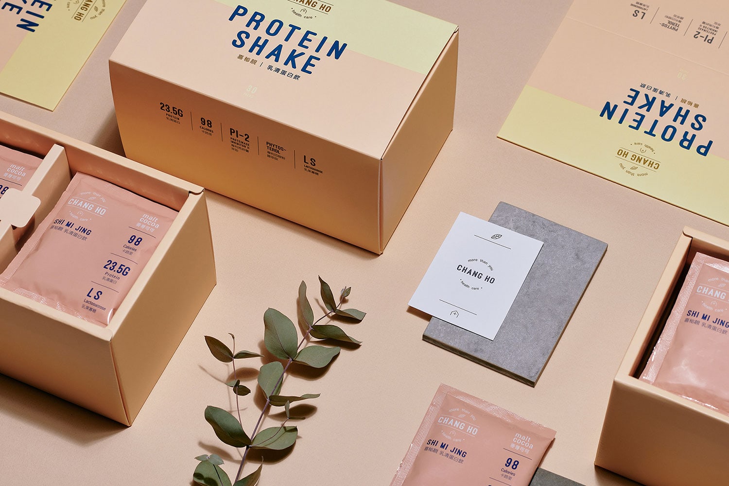
ORIGIN.DESIGN studio designed the identity for SHI MI JING - a brand that pursues a balanced diet between nutrition and pleasant atmosphere. We extend the same idea and deliver the fabulous message through the packaging design. The lightweight, delicate and energetic PANTONE 475C is the base color first chosen with poetic aesthetics.
The inner and outer of the packaging are also carefully considered to match with the gold foil printing, which conveys a great sense of depth. The chic design expresses the unique values of SHI MI JING to pursue a healthy and simple attitude towards life.
Creator: ORIGIN DESIGN Studio