Felix Braden
N/AOctober 25, 2022
Mindsparkle Mag


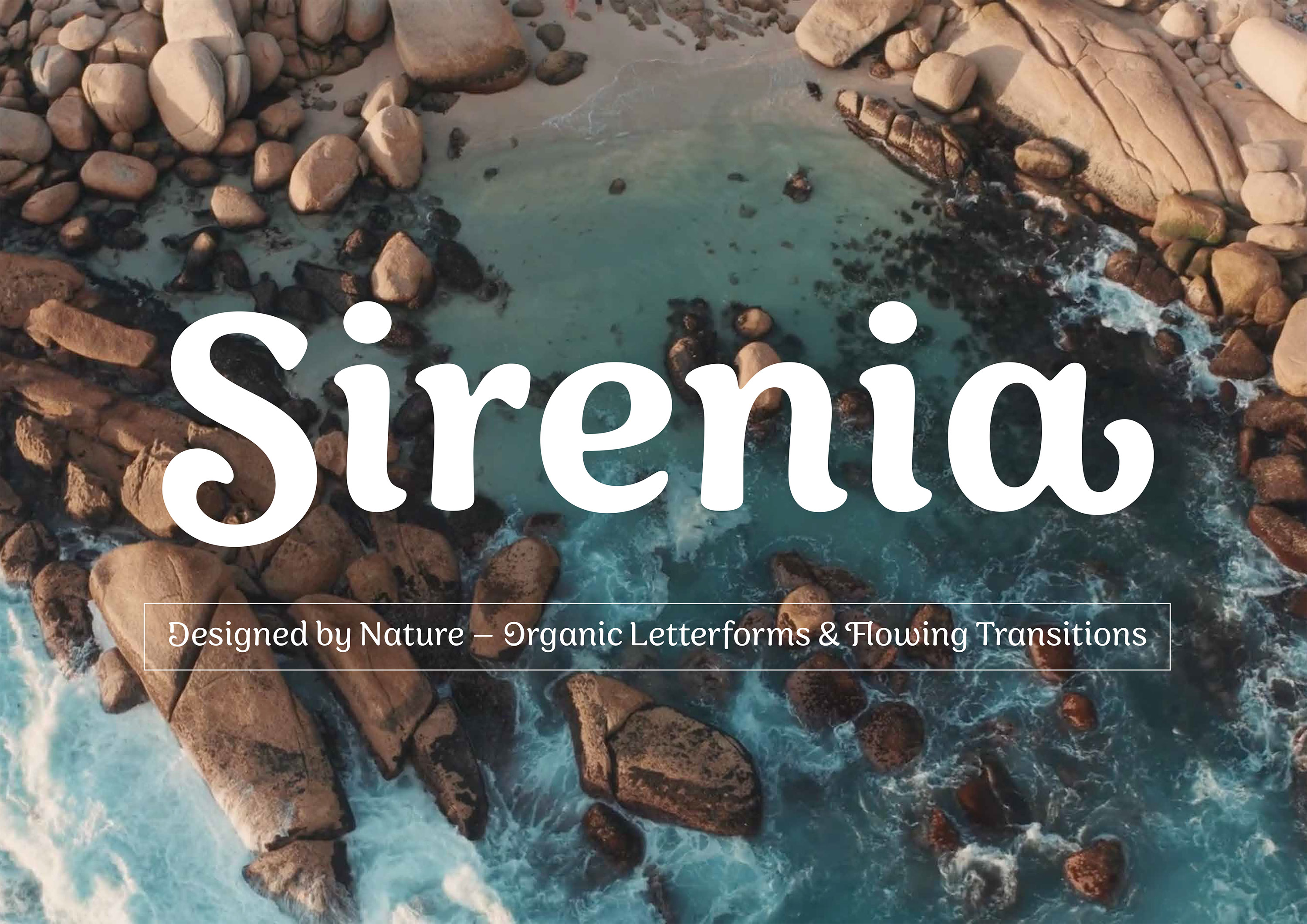
new typeface Sirenia has just been released: Designed by Nature – Totally Organic Letterforms & Flowing Transitions. The best thing about it? During the first month, it comes with a 60% discount on
. For all Adobe Creative Cloud users, it is available through Adobe Fonts at no additional cost.
Sirenia is a friendly display face with rounded corners and flowing transitions. The letters have a very organic look and feel, as if naturally grown. There are clear calligraphic influences in the typeface, since the letterforms are based on a written construction, all drawn with a single stroke. This authentic natural look is ideally suited for lifestyle products, the food & beverage sector and for sustainable design. With nine weights and corresponding italics, the typeface offers a wide range of expressions: If the light weights appear elegant and filigree, the typeface changes its character to a dynamic brush typeface in the medium weights, and in the heavy weights it takes on a fun, almost psychedelic bubblegum aesthetic.
Sirenia’s 1270 characters contain many decorative letters and swash variations for initial, medial and final letters. This gives the designer the possibility to work more as a lettering artist than a typographer and to create lively logotypes according to his own ideas, matching the respective letter combination. This makes Sirenia a great choice for branding, packaging and advertising. Despite its display qualities, Sirenia is also well legible in small font sizes and also looks good on the screen. Some words about the process that went into this font: The early work on Sirenia started twenty years ago with a student project at the University of Applied Sciences Trier with Prof. Andreas Hogan.
Using the Blend Fonts feature of the type design software Fontographer, Felix tried to interpolate different type styles and take inspiration for new letterforms from the fragmentary results. By blending the unpublished typeface “Somnolence” by his mentor Jens Gehlhaar with a sans serif typeface, Felix developed the idea of an upright cursive that combines rounded drop-like serifs with the upstrokes of a handwritten script. The project was later published as a single font under the name “Sadness" by the famous foundry of Swedish type designer Peter Bruhn, who died unexpectedly in 2014. Two years ago, Felix stumbled upon his old designs again and was surprised by the good legibility and relevance of the design. The organic shapes and ornamental curves made the font look like a contemporary antithesis to the minimalism of Geometric Sans. He decided to expand the font as a family and completely rework it.
The designer started with manual drawings and quickly realised that the contrasts between angular and rounded terminals were too much for a single typeface. Therefore, he drew consistent shapes that reminded me of flowing, melting forms. This changed the design so much that I decided to rename the typeface “Sirenia” – a reference to the hanging snouts of manatees. In the last step, Felix added numerous alternative letters to the alphabet. The nature-inspired design simply made sense to have ornaments grow and flourish. So there is at least one alternative for each letter and three or four variants for the majority of them, giving the user lots of options for combining letters in a lively and expressive way.Sirenia is available on
for $49 per style and $495 for the whole family. As an introductory offer during the first month, it comes with a 60% discount. For all Adobe Creative Cloud users, it is available through Adobe Fonts at no additional cost.
Creator: Felix Braden