Credits as quoted above
N/AMarch 01, 2018
Mindsparkle Mag


SM Entertainment, one of the largest entertainment companies in Korea, needed a new identity that could flexibly respond to the media while expanding its business scope beyond music to sports, fashion, and lifestyle.
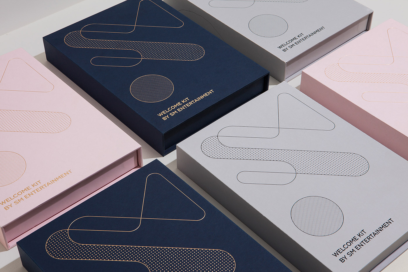
The new visual identity inspired by the light that symbolizes all the celebrities and content of SM Entertainment. The light moves smoothly and shapes the circle, and the circle evolves into various shapes, forming a symbol connecting the letters S and M.
The new symbol of SM Entertainment is a flexible identity that can be continuously transformed and expanded, representing a company that constantly evolves according to trends. Various circular shapes and symbols form colourful graphics and patterns which have become the design essence of the SM Entertainment identity.
Credits:
EXECUTIVE PRODUCER: SM ENTERTAINMENT CO.,LTD. PRODUCER: SOO-MAN LEE - CREATIVE DIRECTOR: Hee-Jin Min ASSISTANT DIRECTOR: Min-soo Yoon ARRANGEMENT: Da-sol Kim, Jee-eun Kim
CI DESIGN
[SM Creative Division] Director : Hee-Jin Min Design : Min-soo Yoon, Da-sol Kim
[CFC] Director : Charry Jeon Design : Yoon-ji Nam, Sae-rom Kang, Eun-ju Kim
Creator: Credits as quoted above