Design Studio BATON
N/ANovember 03, 2021
Mindsparkle Mag


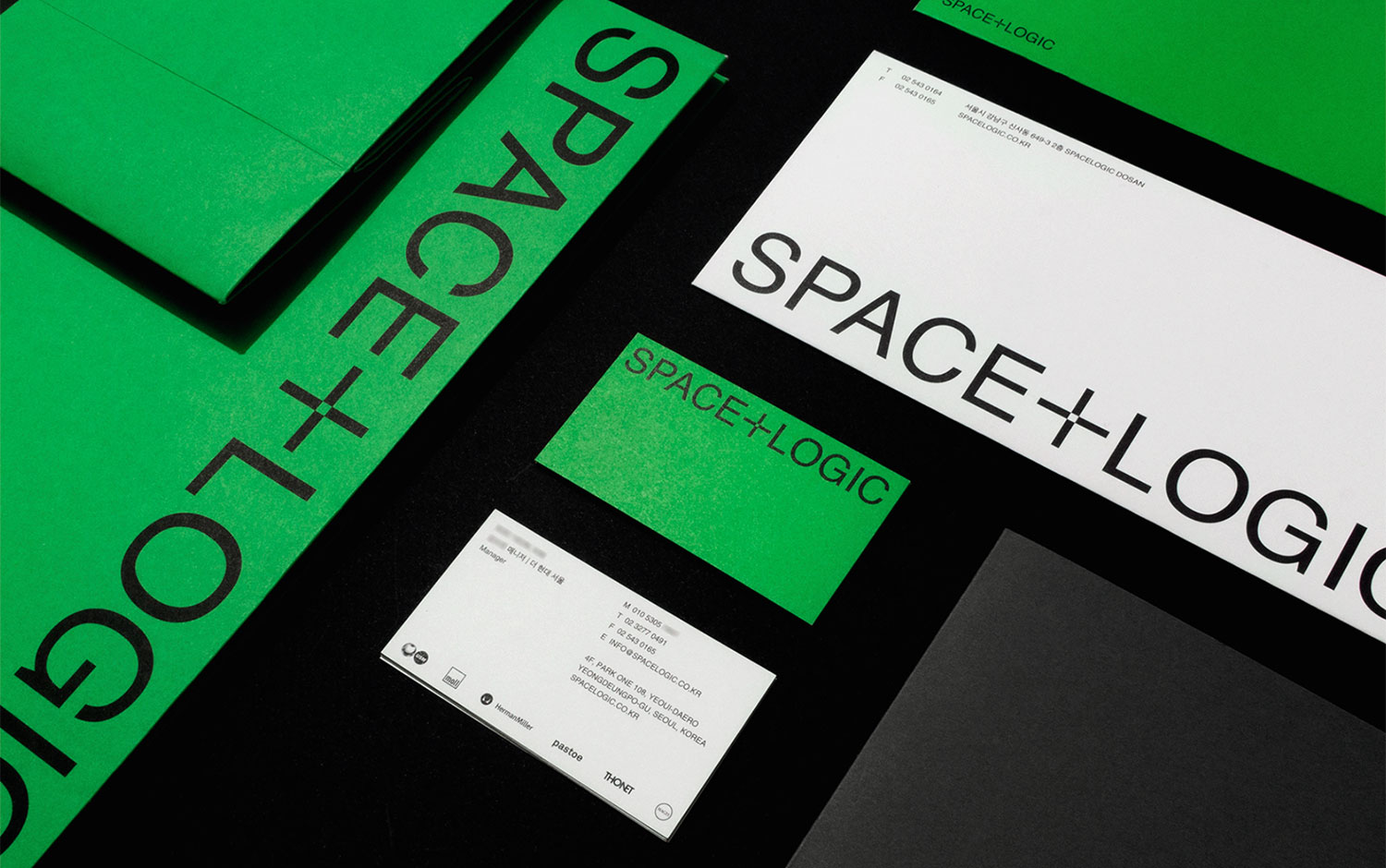
"Form follows function" is Spacelogic's motto for its brand renewal in 2021. Located in South Korea, this distributing brand of Swiss modular furniture also has a partnership with other renowned brands like Herman Miller, Thonet, and Magis, among others. Spacelogic asked Design Studio BATON to create a more representative visual identity for its business.
Based on the brand's philosophy, well-known among architects and industrial designers, the brief was clear to reflect its expansive purpose and emphasize the module itself and the modular composition. All this, mainly inspired by the iconic USM joint. Through its products, Spacelogic continually aims to create the perfect space for all of its customers. Baton's designers came up with a modern and ultra-clean composition, where the negative spaces play an essential role in the logo and typography. Plus, the strident green tone gives an eye-catchy and super technological look. The choice of using Helvetica says a lot about the removal of extra components, as we couldn't think of a clearer one. Also, we wanted to highlight the grid inside the stationary envelopes; they are stunning.
All in all, we’re pleased to showcase such an exhaustive branding clearance. It actually takes a lot of work to create a functional concept for such a technological brand and so ‘simplistic’. And we love its overall appearance :)
Additional credits Art direction & design: Ari Lee Design: Hyeongwon Ha Assistant: Jilhye Lee Photography: Donggyu Kim
Creator: Design Studio BATON