Bunker3022
N/AMay 07, 2017
Mindsparkle Mag


Sparaw is a well-known brand based in Buenos Aires which sells cold-pressed juices and vegan food. Sparaw cares about really nourishing your organism and taking care of the planet. They use 100% organic food taken from their own orchard and use ecologic packs.
had the challenge to redesign the whole brand and help to setup their first store in Recoleta. They needed to transmit the "organic" concept, but being Sparaw a premium brand, they didn´t want to do it in the obvious way (kraft paper and pallet wooden style). Sparaw's processes are so clean and lab styled that using a drafty look didn´t seemed an option. So
got together wit Martín Richards –their talented chef– and started a research about the whole making off. Te result was a bunch of textures (mixed food, zooming microscopic organisms, bubbling water, splattered food) combined with a fluo pastel color palette which helped us transmit energy. For the logotype
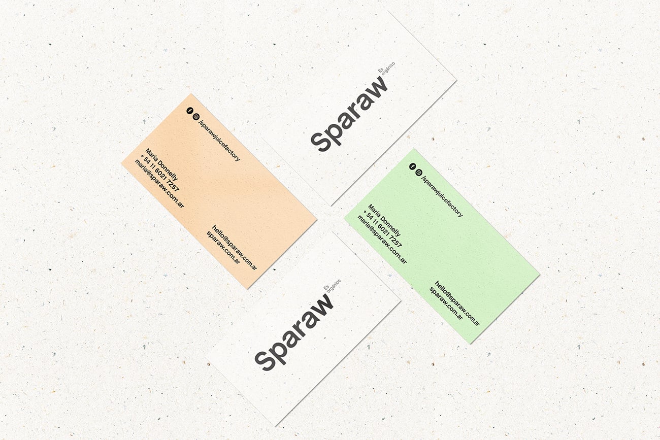
aimed to develop a solid brand with a strong presence. So they chose a font similar to the Helvetica but with a much modern look (Chalet font) and made a little twist in its morphology so as to conceptualize the soft and human side of Sparaw.
Creator: Bunker3022