Dany Vo
N/AOctober 29, 2021
Mindsparkle Mag


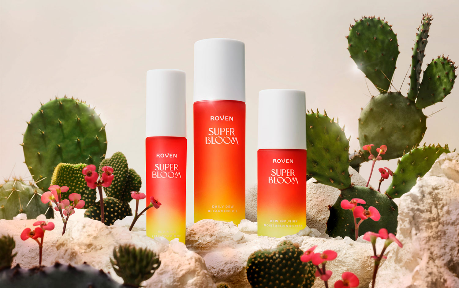
Skincare is one of the most popular routines to pamper ourselves. However, it's super important to take care of the most exposed skin. Today, we're back with a type of packaging we love due to its complexity when reflecting a visual identity. Online wellness lifestyle retailer Grove Collaborative tasked Hatch with the launch their skincare brand, Superbloom.
The brand makes its products with the latest botanical science and clean ingredients. Superbloom’s 100% vegan formulas are carefully crafted to defend your skin from modern aggressors, like pollution, blue light, and free radicals. Brighten, tighten, and protect your skin with some of the most powerful plants on earth. Inspired by the potent natural botanical ingredients, Hatch created an identity and packaging system that boldly commanded attention in a crowded digital set. The use of watercolor creates an ethereal feel, meant to highlight the power of the plants to help transform the skin into one more beautiful and radiant. The bottles and containers share the same colors as their boxes. The two colors form a gradient, one of 2021's most successful trends. The glass bottles allow the light to pass through, which gives it an inner glow. Details from product form to the unboxing experience aimed to harness the power of delight that naturally comes with a super bloom.
We're fascinated by Superbloom's overall identity and how Hatch managed to create such a vibrant and eye-catchy design. The team's decisions turned out great for Superbloom.
Creator: Dany Vo