Agency: Marka Network, Creative Director: Mustafa Akülker
N/AJanuary 15, 2019
Mindsparkle Mag


with Creative Director
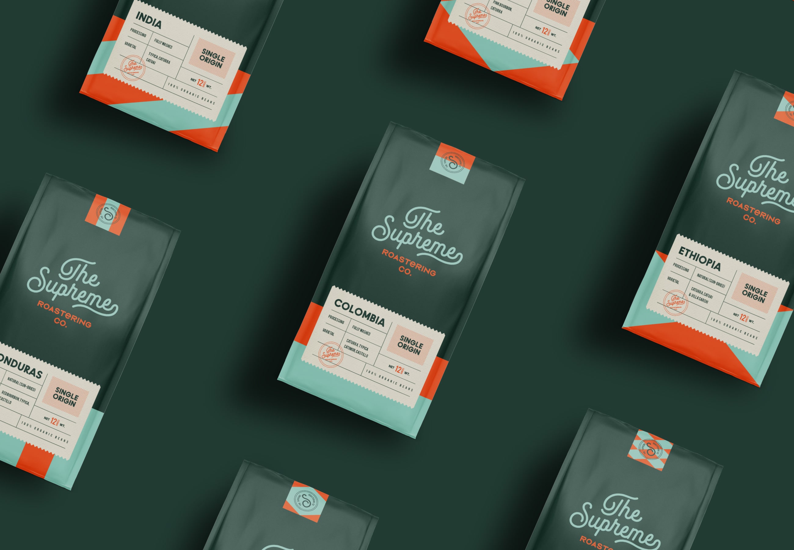
created a brand identity with a vintage and minimal approach for The Supreme Roastering Co. The inspiration for the colors of The Supreme comes from coffee beans. At the same time it was supported by orange tone in order to create contrast. They also used cream tone and soft colors alternatively.
It is a vintage, simple and minimal branding / packaging project.