Daniel Stuhlpfarrer
N/AAugust 29, 2023
Mindsparkle Mag


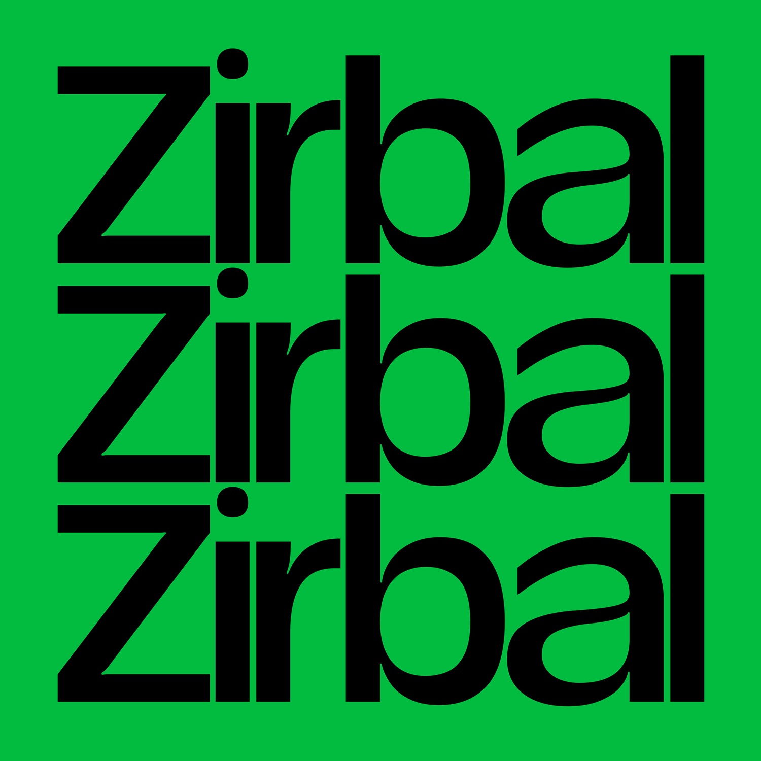
T1 Zirbal Typeface by Daniel Stuhlpfarrer. The harsh weather of the subalpine zone, sharpened the extremely resistant and yet vibrant Zirbal to what it is today. Abiotic hazards cannot harm it, and so it exists symbiotically from its thinnest to its boldest weight. Zirbal is a robust display and headline typeface that can adapt to the most adverse conditions and formats. Whether extra wide or very narrow environments, Zirbal is convertible and can expand from Condensed to Extended. Like its namesake the Swiss Pine, with its sinker roots that reach into the deepest crevices of rock and anchor the tree, Zirbal is distinguished primarily by its very narrow spacing, which makes the typeface appear so robust yet contemporary. Like the cone of the Swiss Pine, another focus of this typeface is the fluid gender. This focus is expressed in a special (gender) feature of the typeface, which automatically adjusts the asterisk to match the previously running letter. Born in the alpine region – ready for the big world – it spreads its lateral roots to find use in a wide variety of applications. From headlines in magazines, to posters, labels, logos and entire brand identities, Zirbal is an ideal companion for your next design expedition.
Creator: Daniel Stuhlpfarrer