不毛 nomo®creative
N/AJanuary 05, 2023
Mindsparkle Mag


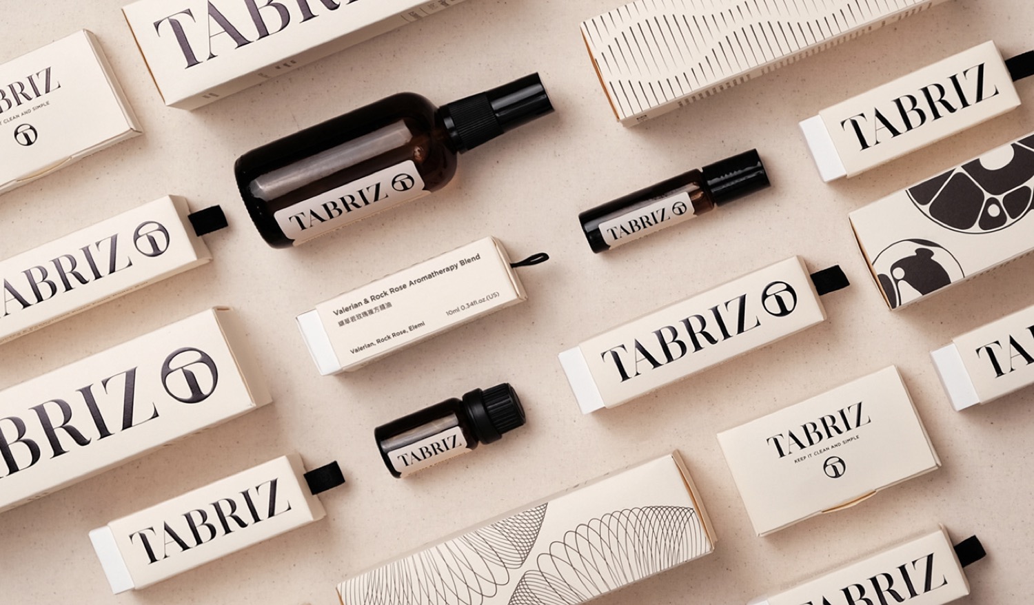
Designed by nomo®creative : TABRIZ, a brand with 30 years of history in the beauty market, uses its factories to strictly control raw materials and procedures for the high-quality control of its products. To pass down the great feelings from the natural scents, they lead people to explore their inner feelings with the fragrance of essential oils. Combining their professional experience and endless innovation brings a brand new image to the consumer markets.
The brand's logo mark design has the concept of the clarity and transparency of water droplets, combined with the brand name's first letter, "T," to convey the brand's natural and organic goals. For designing the logotype, we bring the logo mark's visual gene and combine it with strong strokes contrast to emphasize independent character in modern visuals. Furthermore, the brand's color scheme choose cream and black to create pure and natural visual feelings.
The overall packaging image extends the brand's goals, creating a natural and organic image. By selecting FSC-certified art paper and its color as brand color, with clean and straightforward visual language, to convey the brand sprint of "KEEP IT CLEAN AND SIMPLE." The print design uses the techniques of embossing and UV printing to deepen the concept of the brand's logo mark, which is like a water droplet. Presenting the logo mainly on the packaging series helps the consumer market remember brand identification.
Creator: 不毛 nomo®creative