Otherwise Brands (Branding) and Tano Studio (Interior Design)
N/AMay 16, 2023
Mindsparkle Mag


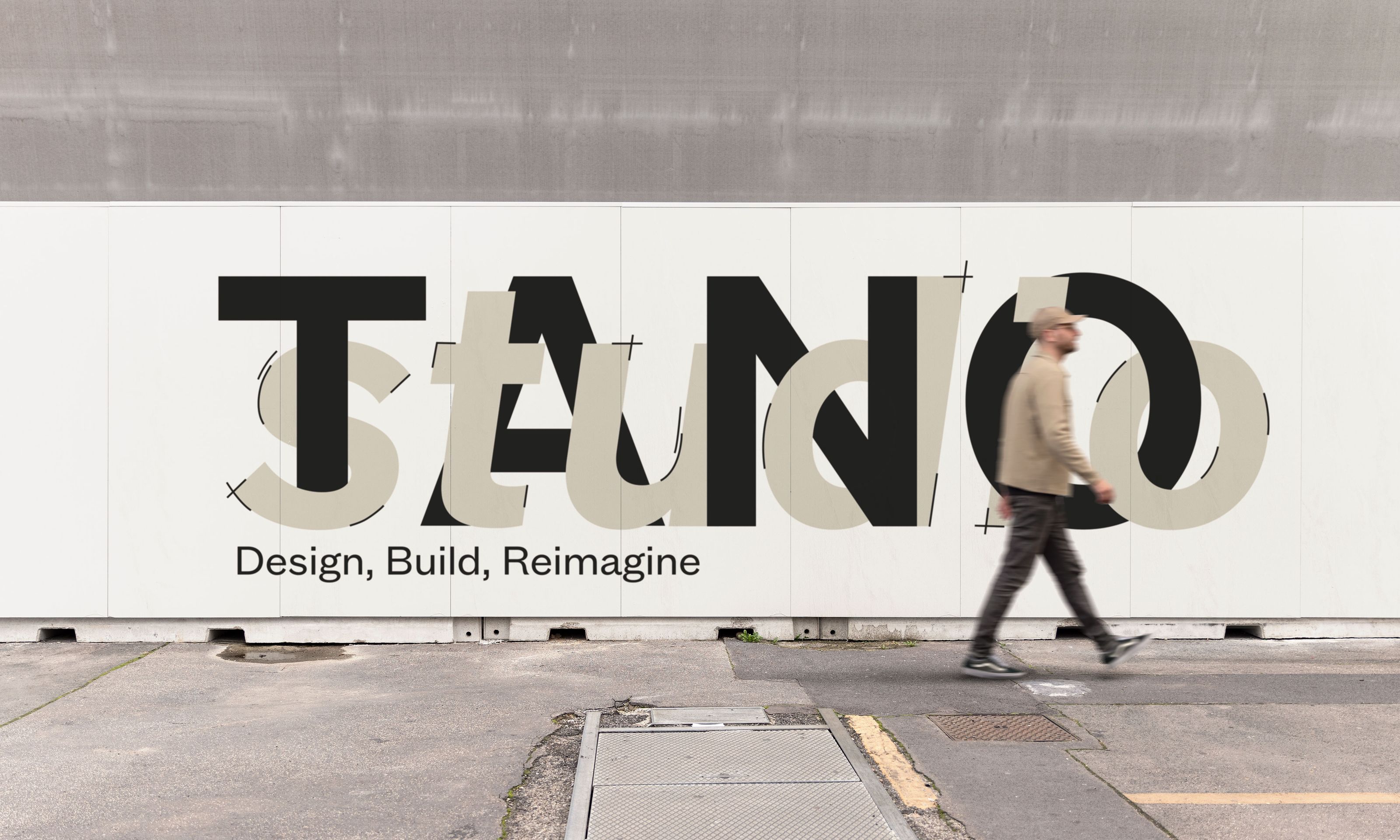
Otherwise Brands were tasked to create a complete identity system for Tano Studio including brand strategy, naming, visual + verbal ID, content production, digital + website design, and environmental + way finding design. The word "Tano" holds a dual meaning, as it indicates emotion, admiration, and emphasis in Japanese and is also a term used to describe a challenging jump variation in figure skatin.
Otherwise Brands drew inspiration from both meanings when developing the name "Tano Studio" as the founders first met as professional figure skaters while travelling around the world on a cruise ship. The brand strategy and visual identity also reflect the founders' partnership in life, business, and sport, with an emphasis on interconnectedness and the importance of combining form, function, and process. This is evident throughout the logo variations and supporting brand elements, such as the "wave" illustration, and is complemented by strong sans-serif typefaces and a calming, earth-toned colour palette.