Agency lg2
N/ADecember 14, 2017
Mindsparkle Mag


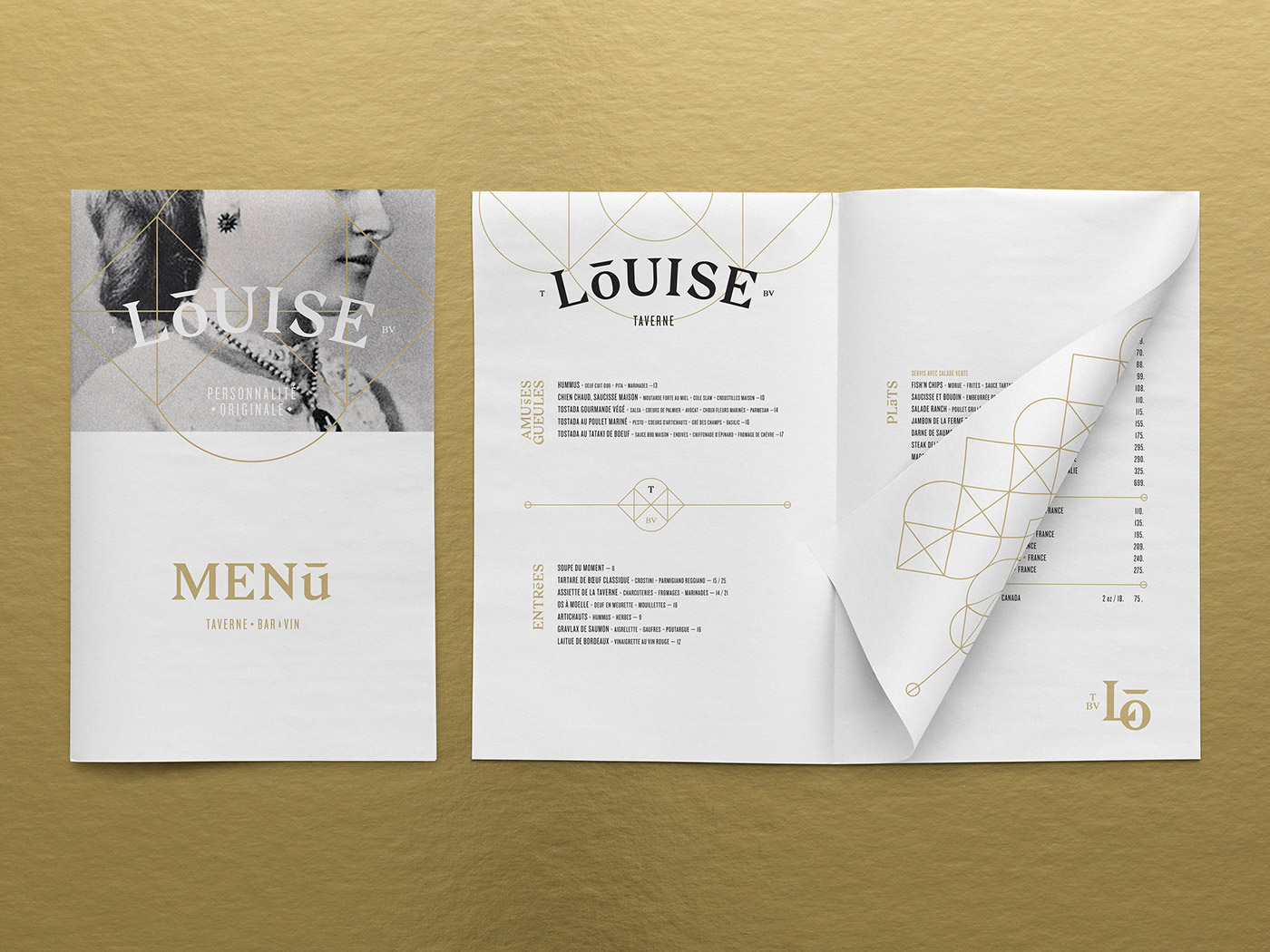
Taverne Louise is a new restaurant whose menu and identity reflects a crossroads between tradition and modernity. The restaurant is located in Quebec City’s Old Port, right in front of its namesake Bassin Louise. Taking inspiration from Canadian heritage, Taverne Louise was named in honour of Queen Victoria's daughter - a significant figure in Canada's history.
Agency lg2 was appointed to develop a logo and visual branding system that reflects the restaurant's uniquely modern spin on tradition. The logo, featuring the letters 'L' and O', takes inspiration from Louise’s royal coat of arms, which lg2 had adapted by simplifying it to its geometric essence. Making further reference to royalty, the letter 'O' is bestowed with an understated crown, and a colour palette of gold and black give the branding a luxe, regal air with a modern touch.
Creator: Agency lg2