Tino Nyman
N/AJanuary 26, 2022
Mindsparkle Mag


Tino Nyman has made a complete rebrand and art direction for TeeMaa, a Helsinki-based tea house with a retail boutique shop, as well as a cozy tea room for customers. The Teemaa brand combines a Nordic lifestyle with a version of tea culture that is contemporary and approachable.
Besides refreshing their visual identity, TeeMaa also wanted to renew their shop. Creative agency Yatofu Creatives took on interior design. Together with Tino Nyman, they formed the new branding and created visual design concepts for the brand identity and the interior. Teemaa’s visual identity and interior reflect the founders’ values: honesty, transparency, and quality. The design concept sought to present a tea brand in a fresh and sophisticated way.
“Together with Yatofu, we wanted to reference both the rawness of tea as an ingredient, as well as reflect the sophistication and complexity of the tea through modern and refined lenses.” — Tino Nyman
While the interior relies on the duality of raw and stylish materials, the visual identity emphasizes the premium side of the tea house. To avoid the clichés of tea culture imagery and visuality, the color black was brought more strongly into the applications of the brand. The identity emphasizes the diversity of tea categories with a wide secondary color palette, each defining one of the nine types of teas that TeeMaa serves. The visuality relies on the sophisticated balance between a black and white tone of voice with vivid colors.
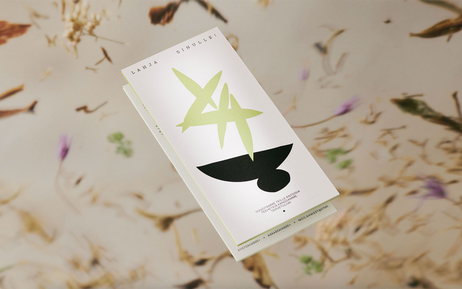
Organic and simplistic illustration elements refresh the otherwise minimalist and elegant identity. The imagery's tone of voice highlights both the premium and playful side of TeeMaa. It has two photography styles: editorial still-life images and abstract background images. Still, life images rely on presenting raw textures combined with tea serving utensils through contemporary and playful set designs. The vivid background images are inspired by the tea plant itself and bind their colors and different ingredients together with a distortion effect.
The most important identity application is the packaging on an on-demand basis. To avoid unnecessary overproduction, we created sticker sheet templates for the packaging's label. They can then always be printed according to their tea product consumption. Its background color is color-coded according to the tea categories of TeeMaa products, making them easy to distinguish on the shelf.
Creator: Tino Nyman