Wunder Werkz
N/AFebruary 10, 2022
Mindsparkle Mag


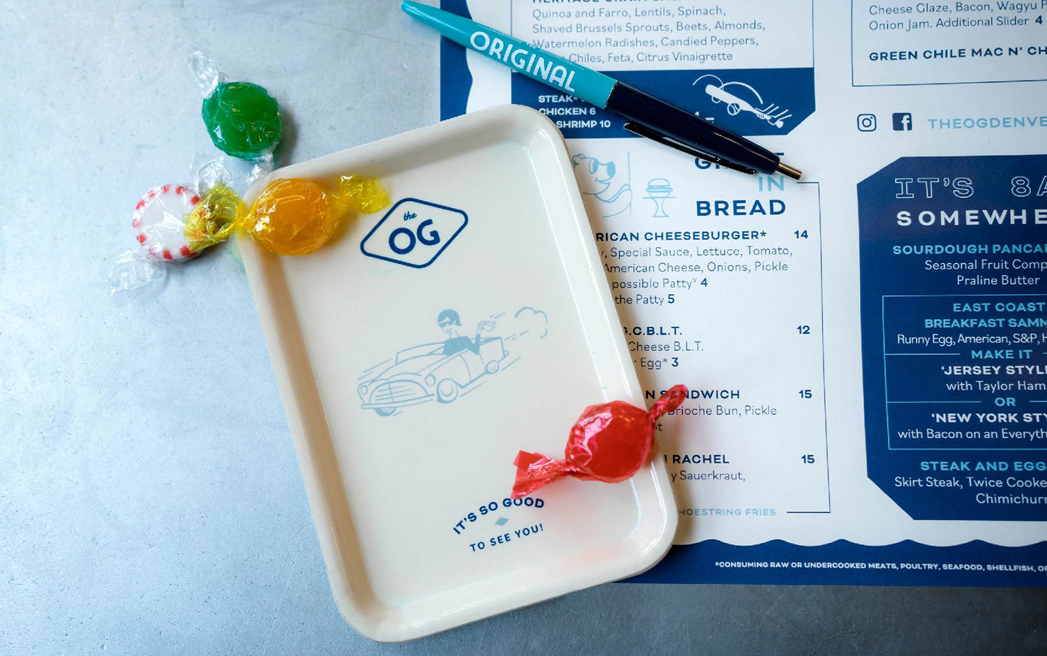
The Original was a reimagining of classic diner culture for the modern age, capitalizing on a 1950s aesthetic but with a contemporary twist. This classic 3 meal restaurant was originally started in Portland in the mid-2000s and was due for a visual refresh as it entered the Colorado market. The updated identity design by Wunder Werkz had to invoke a different era without being too niche or campy so inspiration was drawn from timeless mid-century automotive typographic studies and paired with a cool, tonal palette. The system was further expanded by a series of typographic glyphs and an illustrative system that is both playful and informative to The Original's offerings.
The collateral system was based on a sense of analog tactility utilizing a variety of heritage paper stocks. The placemats/menus immediately invoked another time and were paired with thoughtful brand applications like embroidered shirts, custom flatware, and diner mugs. The signage needed to be classic yet unexpected - Wunder Werkz achieved this with a number of heritage materials and techniques used in unique ways. The marquee sign was a mix of channel letters with fly-off neon that leads to the door, whereas the main entry uses folded steel to create a lenticular logo visible from any angle. Inside Wunder, Werkz used globe lights and a custom typeface developed for neon to illuminate areas of interest and primary offerings. The results were a nostalgia-invoking brand that still surprised and carried a modern edge.
Creator: Wunder Werkz