Studio Otherness
N/AJanuary 01, 2022
Mindsparkle Mag


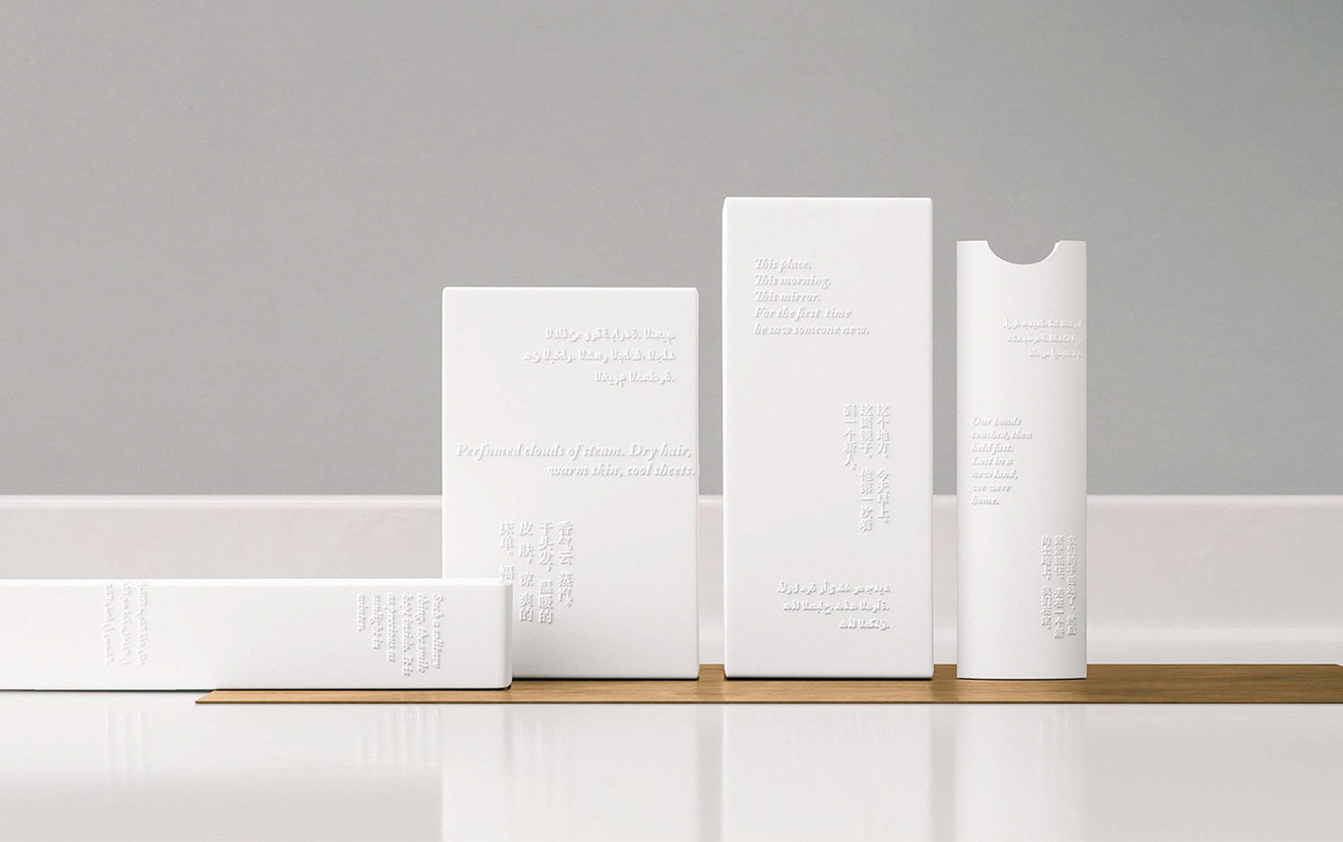
The first day of the year is here, and we're all looking for a fresh start. And what's a better plan than traveling out of your city? Only if possible, of course. So, let's already picture ourselves somewhere else; how does that special place look? Today we're showcasing The Poetry of Travel's packaging designed by Studio Otherness.
Creatives make us imagine an escape portal where color returns and the newness of everything is bright and hyper-real. Literally what we're craving during the year. So, they designed a new set of in-room packaging concepts from soap to a toothbrush for a luxury hotel. The creative team pulled from the hotel's global destinations and created two-sentence poems to engage the imagination and inspire another journey. Contrarily to the Kiwi rugby team, The Poetry of Travel packaging reminds us of our NYE's outfit looked before spilling some drinks on it. Its typography choice, which is embossed later, gives a fresh and casual aesthetic, similar to how we feel during holidays.
The overall all-white appearance brings some calm before we get in handy back to work. So, this is our invitation for you to take it easy during the first days of the year and enjoy being surrounded by your loved ones! All the best is yet to come; take it easy.
Designed in collaboration with HUGE Inc
Creator: Studio Otherness