Darling Visual Communications
N/ANovember 10, 2021
Mindsparkle Mag


We are what we eat, and that goes for the body and the mind. For this reason, Taste Therapy was born to create food products that enhance both our physical and mental wellbeing and promote positive eating habits. The Taste Therapy brand believes that the concept of mindfulness transforms the relationship we have with food. It becomes a lasting experience of wellbeing that allows us to live more fully, from being an indulgence with short-term rewards. And Darling Visual Communications was in charge of communicating this.
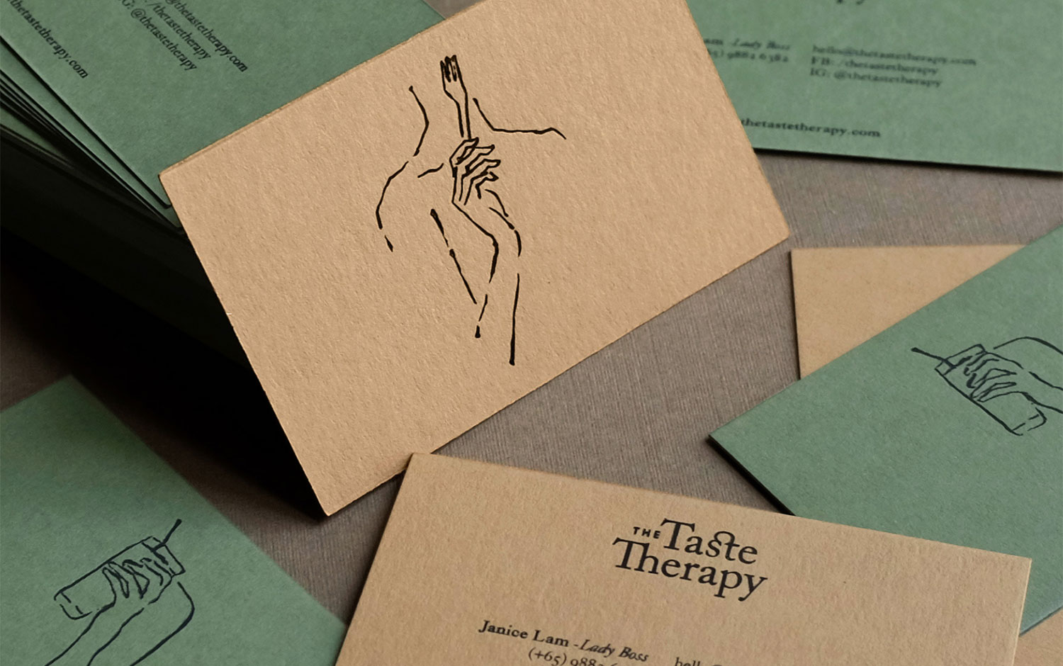
The visual approach designers took was timeless and down-to-earth, tying the notion of food to equilibrium. Behind the visual identity is rooted in the spirit of mindfulness. The figure-sketch acts as a graphic motif for this new identity, while the color palette inspired by nature brings calmness, warmth, and harmony to the brand. This warm and inspiring branding design looks stunning, and its Mediterranean colors take us to the culinary theme. Plus, its rustic and natural appeal drives our vibes towards a healthy and balanced diet. Also, the typography choice with a sweet ligature on the cap T gives the brand's logo a smooth and kind feel.
All in all, we embrace these kinds of hand-drawn designs as they draw us back to the initial moments of the design process when we're trying different ideas and styles. However, it's not quite usual these days to stay in a drawing-inspired design, so we are happy about it! Enjoy The Taste Therapy branding :)
Creator: Darling Visual Communications