VDG | Shanghai Version Design Group
N/AJune 12, 2023
Mindsparkle Mag


The construction of the brand seems to be a voyage, the original mind is a compass, heavy fog everywhere, can only continue to go forward. And different brands have different body structure and internal system, the product is brand strong strong bones, the output value is analogous to flesh and skin texture, appearing as the looking for at this time to belong to its breath way, how to do a hand and should be as the heart of visual image system, give the brand a standard answer, is we the project.
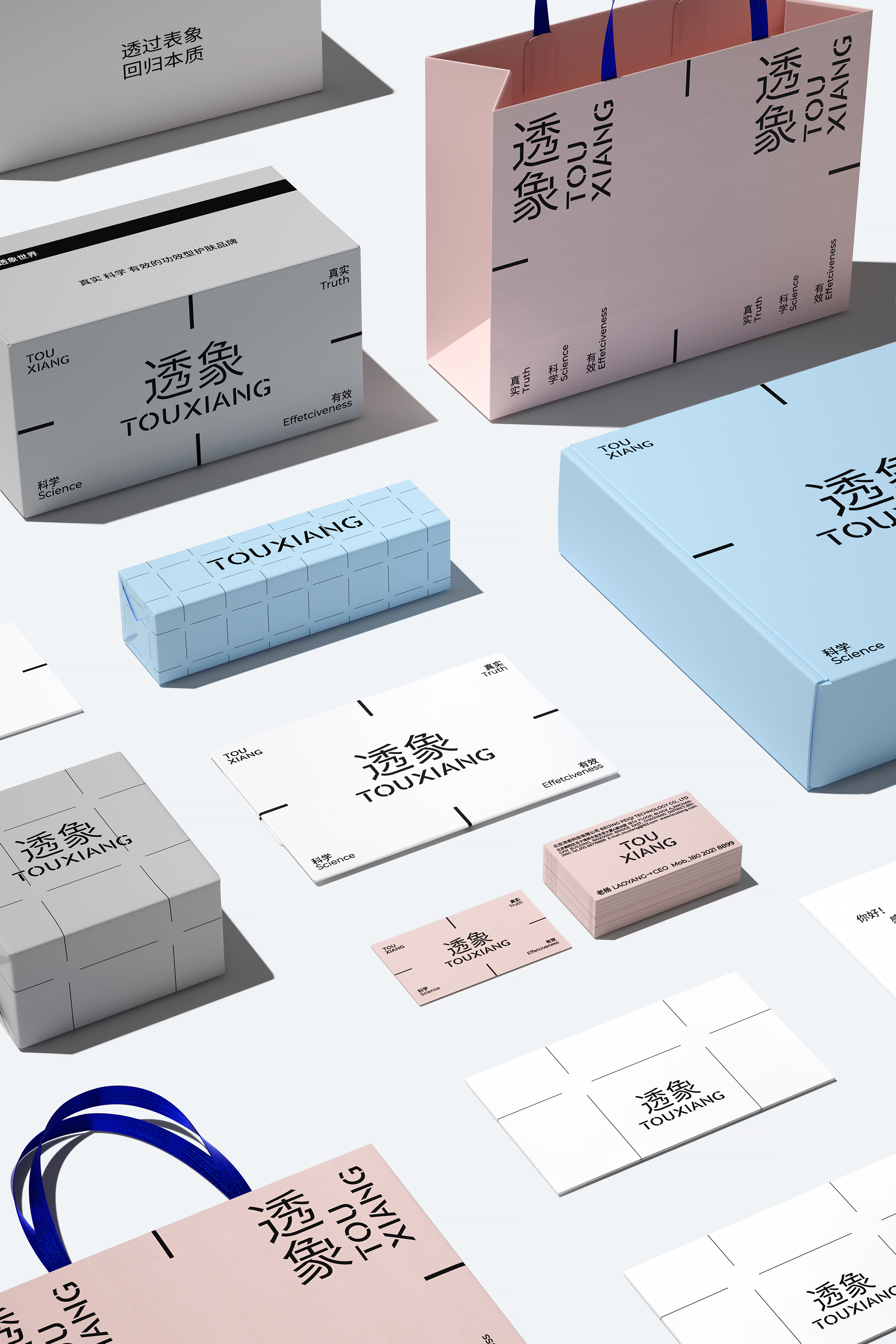
The focus problem undoubtedly becomes the visual clue of the brand. VDG extracted the focus line as the gene. Other elements accessible to the brand are stripped, no matter the composition illustrations or gorgeous colors, until only the necessities are left, in order to confirm the importance and specificity of the product, while presenting more imagination space to the audience.
But the vision also expresses the transparent aesthetics of the brand, conveying the sense of light breathing in rationality. VDG have created a visual language that is developmental and flexible, highlighting unique structural foundations in typography rather than simply expressing linearity. It is also expected to be easy to understand, implement and format as the brand continues to be used.
Creator: VDG | Shanghai Version Design Group