Fable&Co.
N/ASeptember 04, 2021
Mindsparkle Mag


So, earlier this week, we've showcased Tquila Automation's website, but we were amazed by its modern and eye-catchy branding for this intelligent automation company. We know it's a radical change for businesses to do so, but with the expertise of this brand and its innovative solutions, they'll be able to game-changing value. Neither do they, when they asked Fable&Co to design their new visual identity.
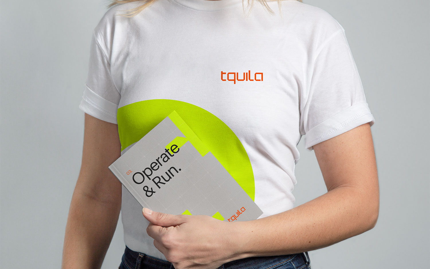
Working closely alongside the passionate and ambitious team at Tquila, Fable&Co. set about establishing a unique brand proposition and visual identity that set the standard for one of the industry-leading and fastest-growing intelligent automation consultancies. Fable&Co. created a modern, technical and robust word marque with angular forms that looked to capture the bespoke approach utilized for each unique client challenge. The word marque featured a customized bold font, communicating technology and stability through its solid and uniform structure. Close attention was paid to the detail falling on the angular cut-off corners of the letters to mirror the same structure evident within the brand icon.
To represent the new strategy and concept of "It’s Time", Fable&Co drew upon this narrative, crafting an identity that showcases efficiencies at its core. Fable&Co created three bold, custom symbols that had elements of the angular Tquila word marque and icon, each designed to reflect one of Tquila’s three service offerings. All these symbols, when weaved, highlighted the areas that intelligent automation transforms business processes and support, or even free, the human workforce. The striking and impactful highlighter yellow introduced a breath of fresh air in the blue-soaked automation space while representing speed, agility, efficiency, and reliability. Plus, the greys and blacks provide a sense of professionalism, sophistication, and credibility. The vibrant orange accent was a subtle nod to the original Tquila color and acknowledged their unique relationship with UiPath.
The new Tquila website would play a crucial role in generating new business leads across the globe. It was fundamental to strike just the right balance of practical and effective, with beautiful and rewarding. The notion of "It’s Time" would be evident throughout, without using digital timers, world clocks, and key messaging.
Creator: Fable&Co.