Bonez Designz
N/AJune 17, 2018
Mindsparkle Mag


Bonez Designz in an independent type foundry based in the Birmingham (UK) area. We were founded in 2012 and have created a wide range of typefaces since. Typefaces by Bonez Designz have had some notable features by Random House, Joiz Germany, and Garnier just to name a few.
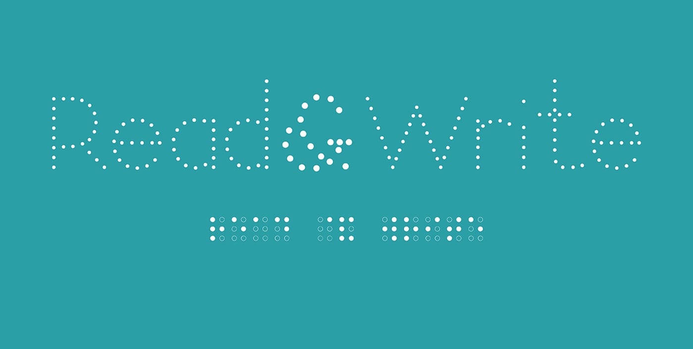
The type family ‘Night’ is the latest release from Bonez Designz. When creating the typefaces the aim was clear, to create a type family that would raise awareness and make Braille more accessible. The typeface aims to achieve this by providing a frictionless way to type and display Braille with little to no knowledge of the system. Now everyone can Type the Dots. The typeface is part of our Type the Dots campaign which raises money for the RNIB.
The main purpose of the typeface is to raise awareness and make Braille more accessible. We feel there are limitless opportunities to spread the use of Braille. You can find Braille on medicine, but very little else in a supermarket. Yet we place many other spoken languages on our packaging. The creation of the Braille weight aims to provide an easy way to start incorporating Braille into projects. The typeface works like any other but rather than familiar letterform displaying, Braille forms display instead, without needing any knowledge of the system.
The history behind the name. In the 1800’s Napoleon requested a code be developed so soldiers could silently communicate in the dark. In 1808 Charles Barbier developed such a system, consisting of 12 dots arranged in two columns which would be embossed to denote particular letters. The system was known as “Night Writing” which Louis Braille would later develop into the six-dot Braille system we use today.
The family is made of 9 weights; three traditional weights, three dot weight, and three Braille orientated weights. The traditional weights have a simplistic and traditional form, allowing everyday application. The dot based weights give the user the option to use it as a display element or when raised can been used as a tactile teaching tool to educate on tradition letterforms. Finally are our Braille-based weights, the display that blends what we are used to and what we are not, to help familiarise people with the Braille form. The outlined Braille, allows you to see the placement of each dot in the grid. The Braille weight in its pure form. The primary language for the Braille weight is UEB, the British standard, however, the weight also has localized language based alternates based on Braille standards of other European countries.
For more information on the type family, the campaign or our other works please visit bonezdesignz.com
Creator: Bonez Designz