Tom Garcy
N/AFebruary 09, 2022
Mindsparkle Mag


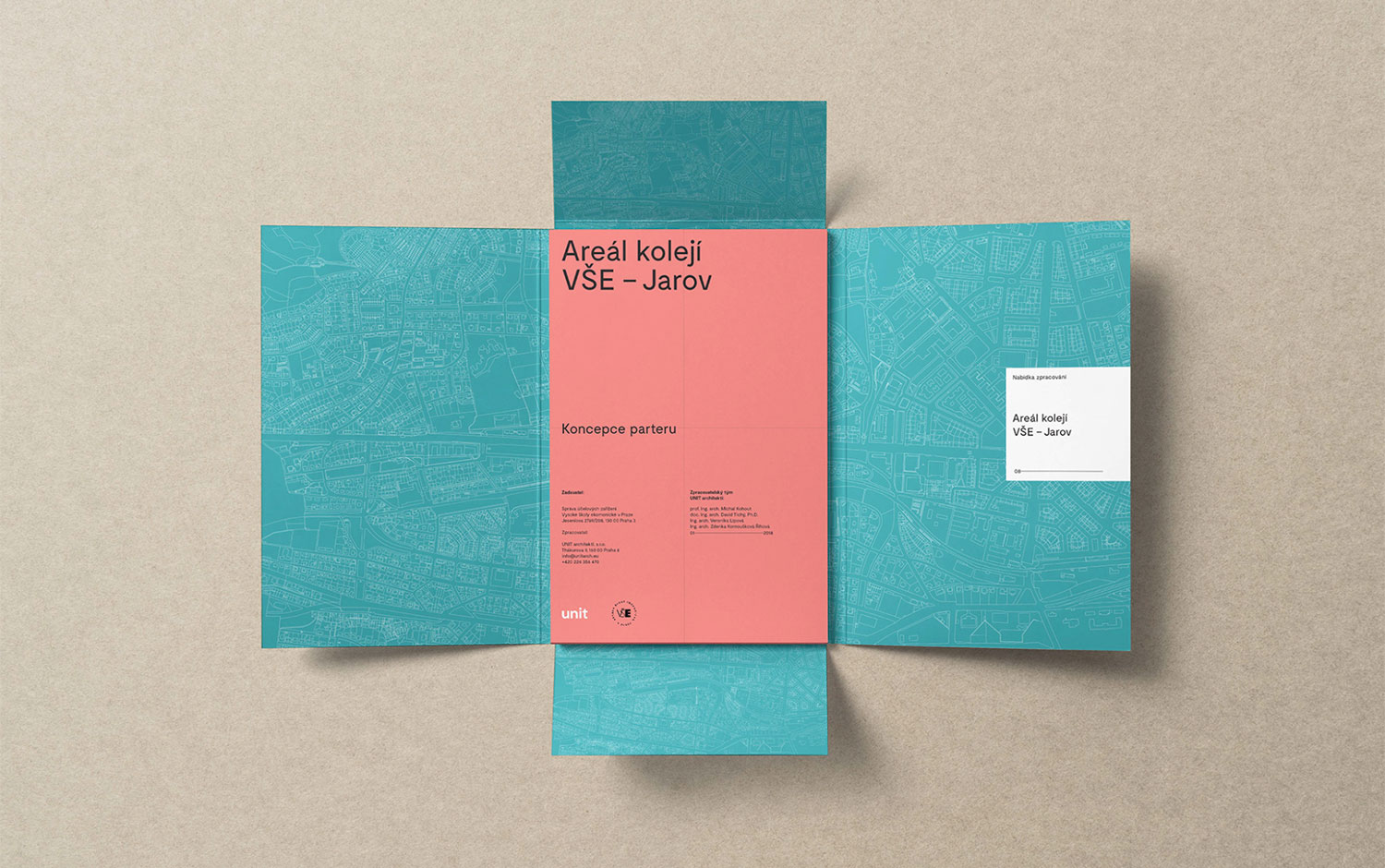
One of the most recognized architectures and urbanism studio Unit looked for a rebrand for quite some time, a classic cliché of having so many projects, you don't have time for your own. Consequently, they asked Tom Garcy to create their new visual identity.
The goal was an evolution, not a revolution, and it took almost two years to have the final guidelines for multiple applications, documents, and layouts. The result is clean, minimalistic, focused on typography and simple elements, a long-term visual identity, easy to use. The stationary Tom Garcy designed features a unique blue hue that's super recognizable and unique. However, the most "radical" change came with the brand's new font choices. And most of the Unit Architects' branding revolves around that decision.
All in all, Unit Architects' new visual identity has a professional look and feel, plus a super recognizable factor that makes it stand out among other architecture studios. Crafted to perfection, Tom nails the brief, handing in beautiful work.
Creator: Tom Garcy