united by, Emídio Cardeira
N/AJanuary 07, 2018
Mindsparkle Mag


The
for Universita Vanvitelli was designed by Emídio Cardeira of design studio
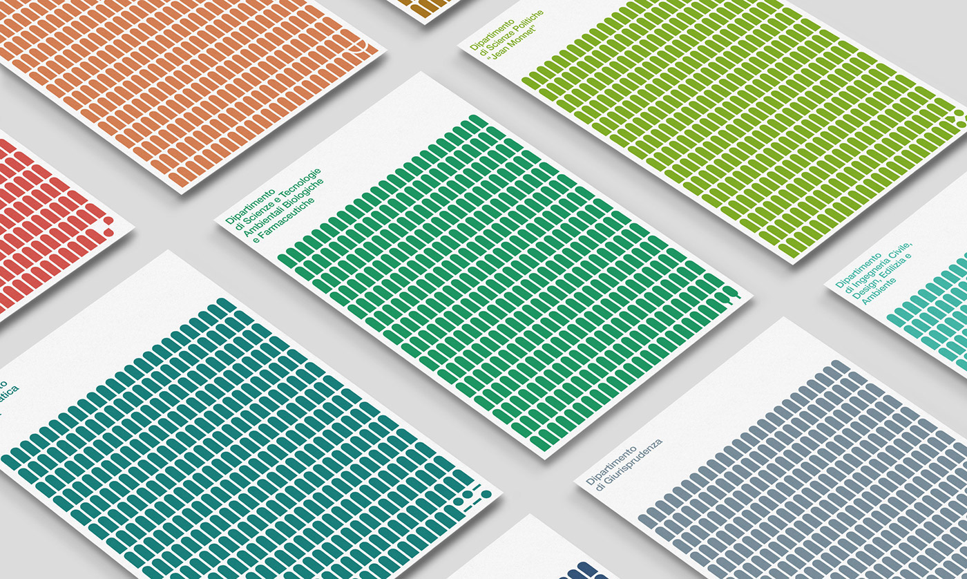
. The Acquedotto Carolino, designed by Luigi Vanvitelli and one of the symbols of Campania region, was the main idea behind the new identity. The aqueduct stands as a symbol of human progress, given that it brings water to feed the thirsty.
According to United By, 'A symbolic parallelism can be found in the purpose of a University: to satiate the desire for knowledge. Each arch is interpreted as a door that the university could create for the future professionals. An expandable set of icons was developed for each department, standing as symbols for the different options provided by the university. Metaphorically, we see each arch as a student, a teacher, a region, a city or a building as an indispensable linking element to create, deliver and share knowledge.
Creator: united by, Emídio Cardeira