Ray Dao
N/ADecember 09, 2016
Mindsparkle Mag


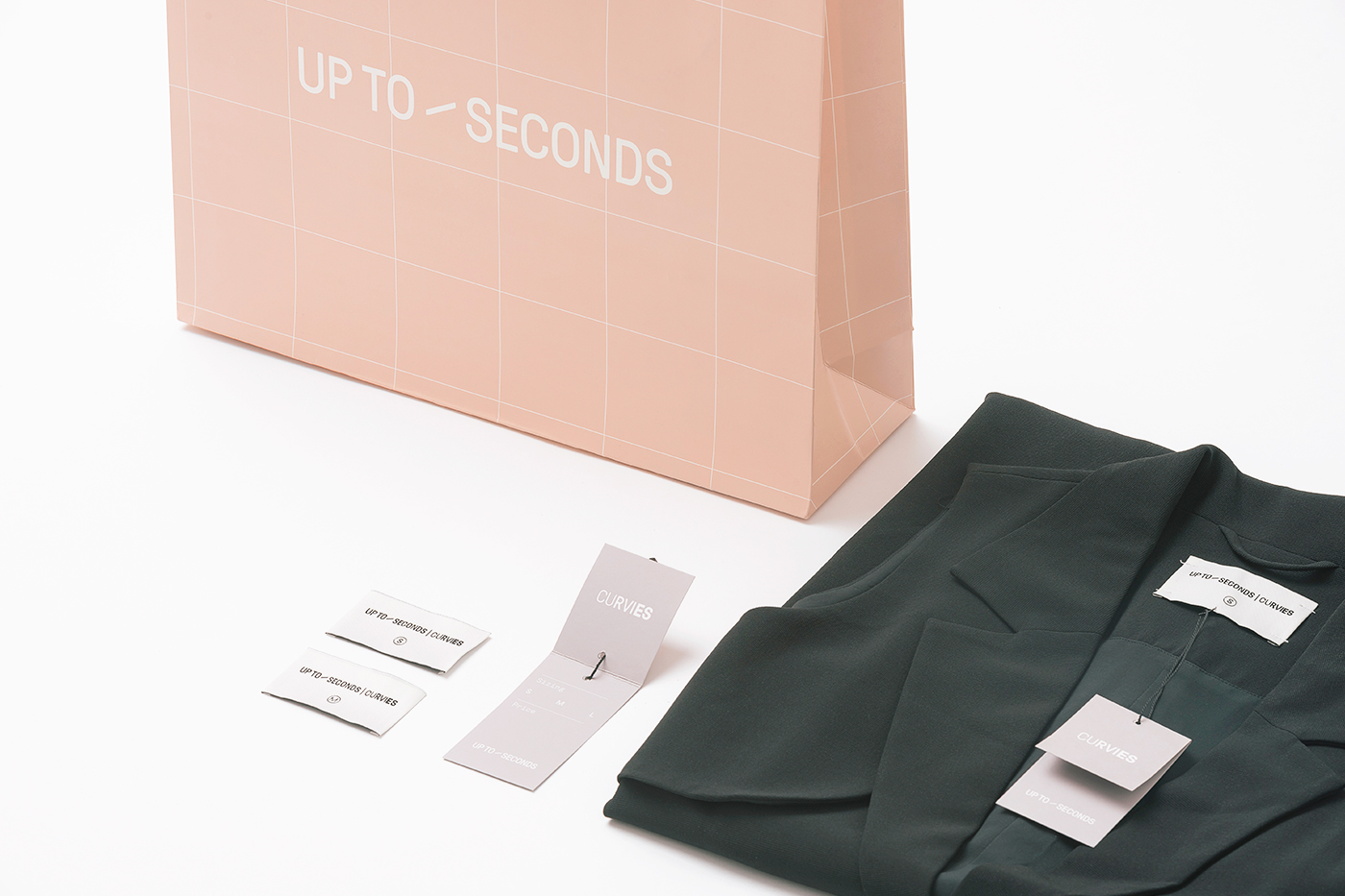
Established in early 2015, Up to Seconds has already became top five fashion retailers in Vietnam for the young generation. UTS is famous for their comfortable fabric and flexible in all shapes and forms. Also the brand presents itself as monochrome and minimal, albeit with the essential pastel pink color. Working closely with both commercial and creative departments, the branding design as well as the store interior was focused with the intention of elevating the value–based chain into an upscale, yet accessible beauty destination—focusing on expertise and a young, sophisticated, modern Vietnamese beauty sensibility. The space inside every store is designed with an aesthetic that closely resembles the design of the brand itself. Monochromatic, white walls, ceiling and defined by a simple layout to let the fashion collections and products come to the fore. The white, minimal interior is backed up by a touch of pastel pink and clean geometric typography on all the brand applications, wall tags, clothing tags and labels. This overall look presents an understated, yet sophisticated take on modern Vietnamese beauty.
Creator: Ray Dao