Bold Period
N/ADecember 18, 2021
Mindsparkle Mag


Nowadays, there's been a boom when talking about user experience and usability as now it's mainly applied to digital products. However, both terms existed for a long time ago. So, today we're showcasing the User’s Useful Use project, aka, UUU by Bold Period.
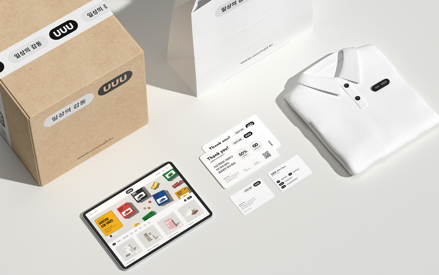
The User’s Useful Use project is a lifestyle brand that offers products and items that aim to simplify user's life. The Bold Period team came up with an impeccable graphic system. The project aesthetic has an extra high quality of products yet is accessible. For User’s Useful Use logo, creatives used the acronym UUU. Encapsulated in a pill shape, these three letters become the main feature of the visual identity, where the U's represent the products and the rounded rectangle a tray, imagining how consumers usually accumulate their purchases in a container. The items vary from home scents to children's toys and pets' balanced food. The pill morphology becomes a repeated feature along with the packaging design. The User’s Useful Use has a modern and super warm look and feel. Each color combination matches the user who is satisfying.
All in all, by setting and applying the pill shape to each category of products, the Bold Period studio built a more enthusiastic visual variation from what may have been seen as strict and simple.
Creator: Bold Period