Urbanjava Studio
N/AMay 15, 2023
Mindsparkle Mag


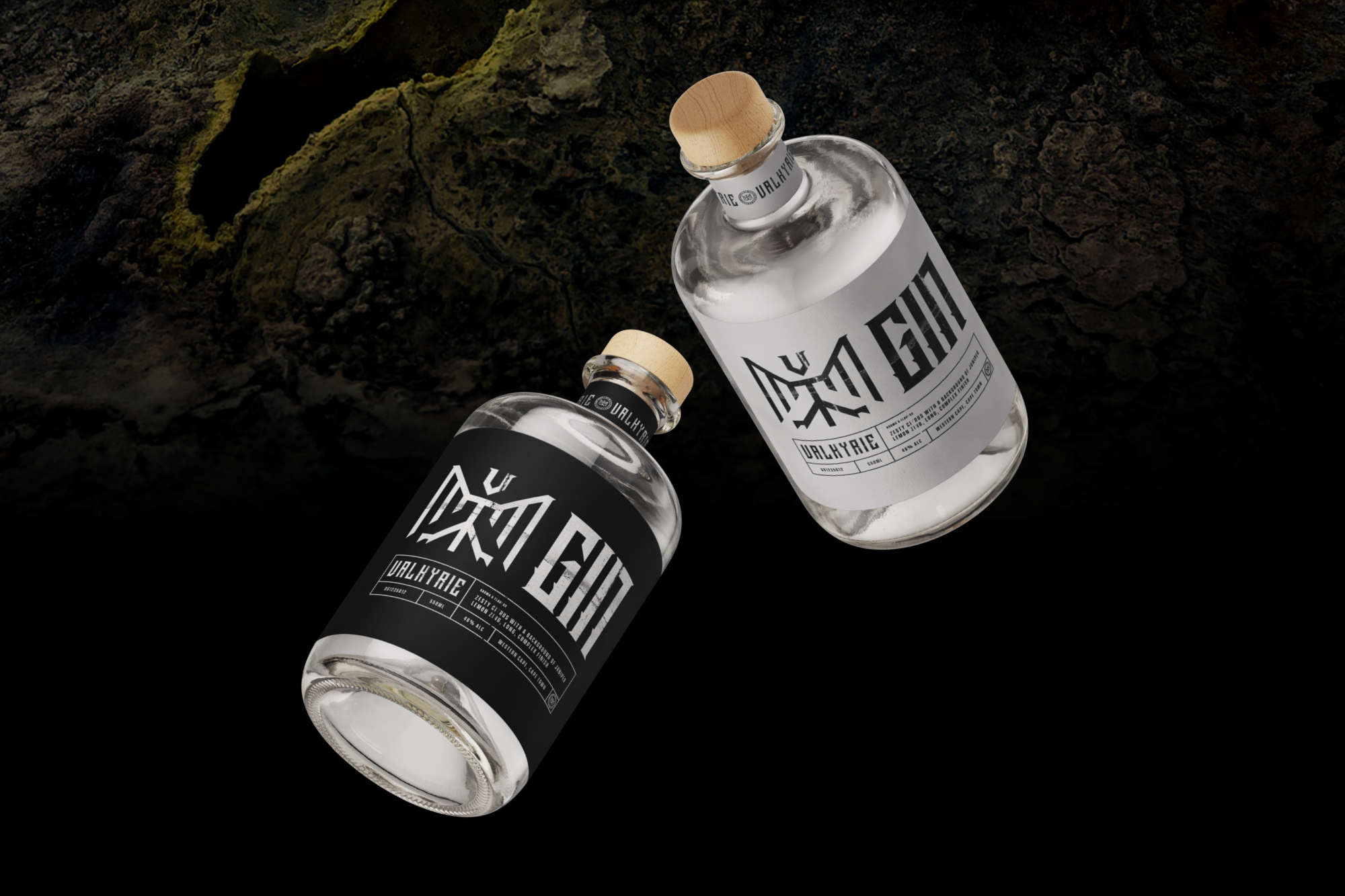
The project is a brand identity system for Valkyrie Gin Distillery's packaging labels, created in collaboration with Urbanjava Studio. The goal was to create a distinctive visual identity that would set the product apart from competitors and appeal to customers who value the story behind their purchases.
The brand identity system features four distinctive marks, including the Wordmark, Brand Mark, Product Mark, and Seal Mark, all custom-designed by Urbanjava Studio. The letterforms take inspiration from old-style serifs and blackletter characters, and "ice-picks" were added to the letterforms to create visual interest.
The Valkyrie myth inspired the brand mark and features a military winged symbol, evoking the image of fair-skinned warrior maidens with wings attached to their armour. This symbol and the custom-designed lettering create a distinctive visual identity for Valkyrie Gin Distillery.
The use of Norse mythology in the brand identity system successfully captures the essence of Valkyrie Gin Distillery's brand values and helps differentiate it from competitors. The design approach by Urbanjava Studio creates a unique brand identity system that can be applied to the product's packaging labels and brings the concept to market.
Thank you for considering our project.
CREDITS:
* Studio: Urbanjava Studio * Client: Valkyrie Distillery Inc. * Category: Brand Idenity * Art Director & Branding: Christo Smit * Motion Design: Ruan Hitge
Creator: Urbanjava Studio