Natasha Jen
N/AJuly 06, 2017
Mindsparkle Mag


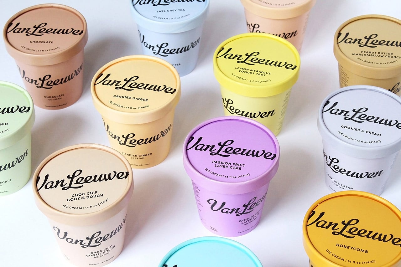
makes high-quality ice cream with the finest organic ingredients, prepared from scratch in Brooklyn and sold in both classic and vegan varieties via trucks and shops in New York and Los Angeles, as well as packaged pints at grocery stores.
’s Natasha Jen and team have created a new brand identity system for Van Leeuwen that position it as the ice cream of choice. Stripping off all the visual noise typically seen in ice cream branding, the new identity deploys minimal graphic elements—the logo and a decisive color palette—that reflects the purity of the ingredients, and colorful pints that stand out in stores and look great on
. Since the introduction of the new packaging in the fall, retail sales have increased 50 percent.
Creator: Natasha Jen