Silk Studio
N/AApril 10, 2022
Mindsparkle Mag


VEL believes that technology should make it easier to get into your flow-state. Their work cafes exist so that people can accomplish twice as much in half the time and then spend the change on life beyond the screen. From reservable privacy pods and seating to walk-ins and more, VEL offers dynamic and adaptable ways to gather, work, meet, and unwind. There are many ways to belong to VEL. Run a one-person empire or gather your entire team every day. They’ll take care of the details. Silk Studio was in charge of its visual identity.
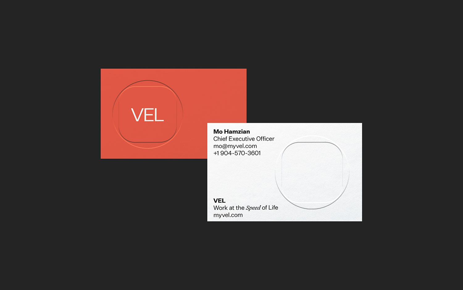
The VEL logomark is composed of a rounded rectangle overlaying a circle. The combination of these forms creates a new form that references typography, with thick and thin shapes coming together to create a distinct expression. Inside the form, the word VEL is nested in all capital letters.
The primary typography for VEL is Untitled Sans Regular. It is a modern grotesque typeface that is clean, legible, and utilitarian. The use of bold weights is possible when required.
As a supplement to the design, Untitled also has a serif version. VEL employs Untitled Serif Italic to emphasize language, especially in promotional materials. It draws a reader’s attention to some words and uses attitude to create hierarchy.
The VEL color palette consists of four colors: white, orange, charcoal, and grey. The pattern system for VEL serves as a decorative element. When VEL wants to highlight its members in various locations, feature thought leaders, showcase entrepreneurs, and talk about the perks of being a member, the pattern system can be a visual mechanism to display the connections between members. It is one way to imbue meaning into the patterns, but ultimately we think the pattern can be used as a flourish when communicating VEL membership—a way to signal elegance and beauty.
VEL Stationery set includes letterhead, envelopes, and business cards. The first two are possible in three colors. The different color options express the brand and can be used for different types of communication–orange for members, grey for corporate relations, and white for general usage. The business card utilizes an embossed logo that pushes through the paper revealing the logo on both sides.
Creator: Silk Studio