Studio KIOSK
N/AOctober 12, 2017
Mindsparkle Mag


Miki Stefanoski and Anastazija Manasievska from
designed the
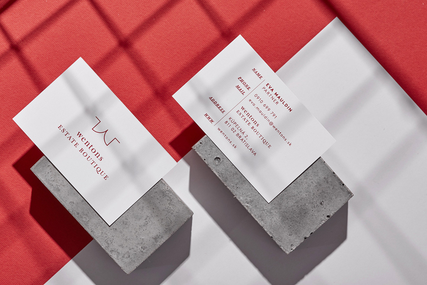
for Wentons, a niche brand that serves as both a real estate agency and a consultancy boutique. 'Both these aspects have a similar weight within the overall brand structure and are tightly bound by the core identity in a clean and functional manner'.
'Set in a historical building in downtown of Bratislava, Wentons is not an agency with offices, but rather an open, directly accessible retail unit from the street. Openness as concept is developed through one simple mark - a combination of the letter W and an open door. An open door is a symbol of new beginnings, and most importantly, provides a view of what lies ahead.
The logo design is modern, constantly moving between the human, corporate and technical. With clean lines, simple typographic treatment and a special attention to details, Wentons seeks the perfect balance between timeless functionality and emotion.
We gave 'numbering' a special treatment in all Wentons brand materials. Every property has a number just like every Wentons branding material is characterized by a unique number (reference, date, etc.) which is slightly bigger and tries to imitate the numbering above each property's door.
The name Wentons is a wordplay of two inspiring historic characters: Winston Churchill and Nicholas Winton, who are personal heroes of the agency's owners. Wentons's personalized experience makes this brand extremely emphatic, approachable, highlighting its values of community and belonging.'
Creator: Studio KIOSK